library(gregbio)
my_life <- blev_født(danmark) %>%
My Year of Riding Danishly
Gregers Kjerulf Dubrow
CopenhagenR
23 April, 2024
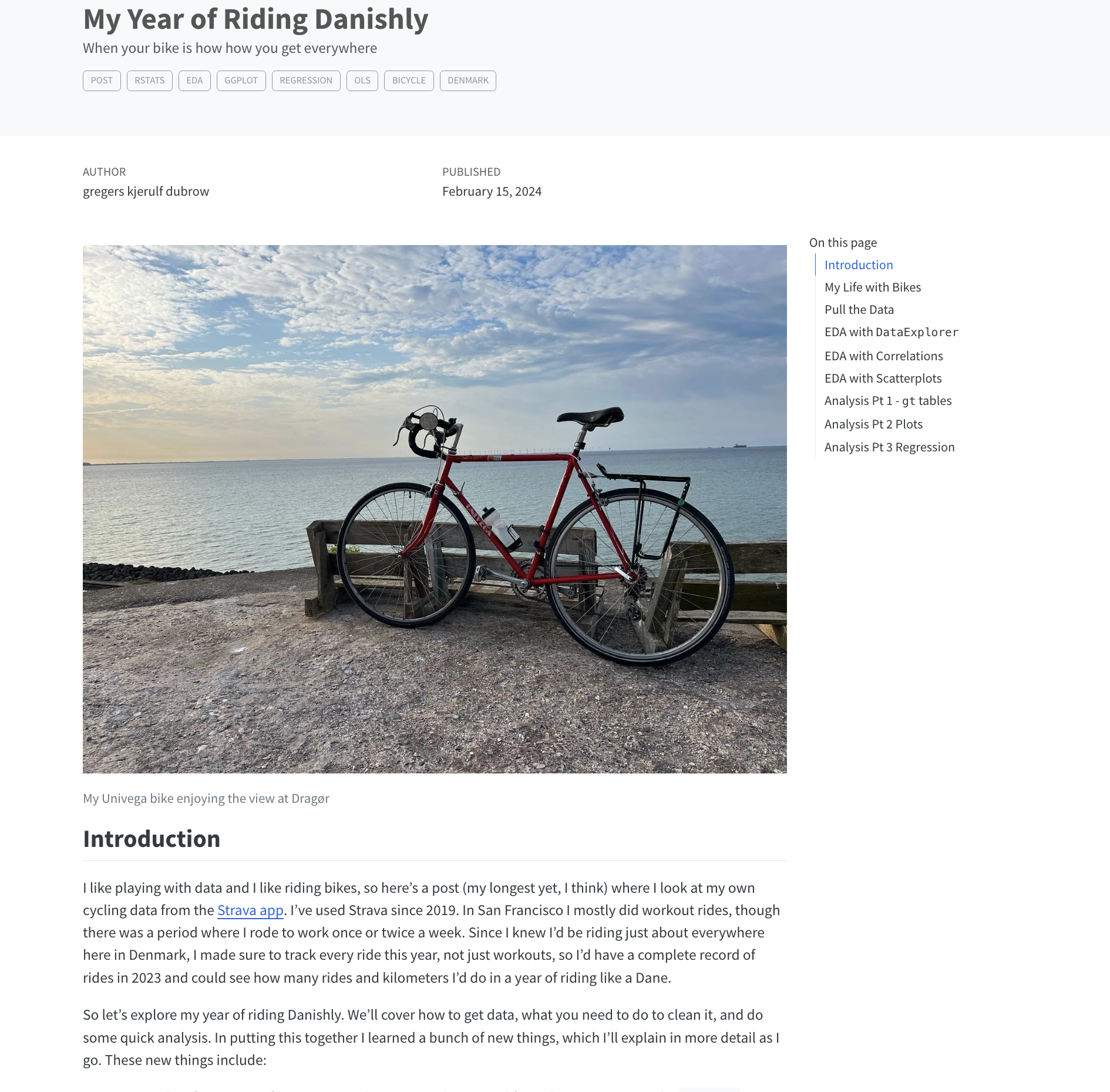
My Year of Riding Danishly

My Year of Riding Danishly
library(gregbio)
my_life <- blev_født(danmark) %>%
        voksede_op(USA,
            state = “Pennsylvania”,
            city = “Philadelphia) %>%
         undergrad_degree(film_major) %>%
         PhD(education_policy) %>%

My Year of Riding Danishly
library(gregbio)
my_life <- blev_født(danmark) %>%
        voksede_op(USA,
            state = “Pennsylvania”,
            city = “Philadelphia) %>%
         undergrad_degree(film_major) %>%
         PhD(education_policy) %>%
         career = case_when(
             job = faculty ~ FIU, (set_location as Miami, FL)
My Year of Riding Danishly
library(gregbio)
my_life <- blev_født(danmark) %>%
        voksede_op(USA,
            state = “Pennsylvania”,
            city = “Philadelphia) %>%
         undergrad_degree(film_major) %>%
         PhD(education_policy) %>%
         career = case_when(
             job = faculty ~ FIU, (set_location as Miami, FL),
             job = data_analyst ~ UC Berkeley & SFSU,
             (set_location as SF Bay Area)
My Year of Riding Danishly
library(gregbio)
my_life <- blev_født(danmark) %>%
voksede_op(USA,
state = “Pennsylvania”,
city = “Philadelphia) %>%
undergrad_degree(film_major) %>%
PhD(education_policy) %>%
career = case_when(
job = faculty ~ FIU, (set_location as Miami, FL),
job = data_analyst ~ UC Berkeley & SFSU,
(set_location as SF Bay Area),
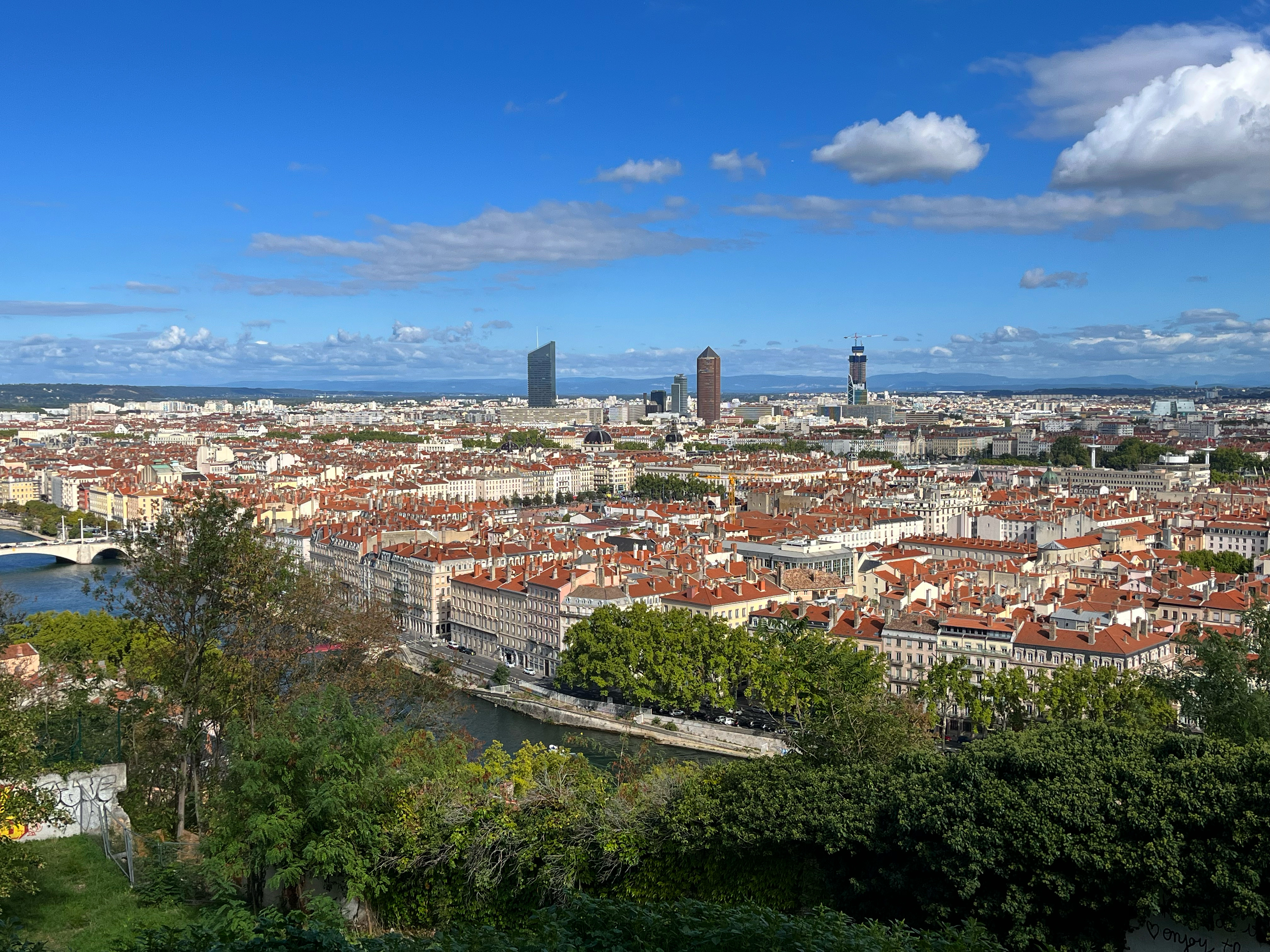
job = career_swerve1 ~ freelance_ESL_teacher,
(set_location as Lyon, FR)
My Year of Riding Danishly
library(gregbio)
my_life <- blev_født(danmark) %>%
        voksede_op(USA,
            state = “Pennsylvania”,
            city = “Philadelphia) %>%
         undergrad_degree(film_major) %>%
         PhD(education_policy) %>%
         career = case_when(
             job = faculty ~ FIU, (set_location as Miami, FL),
             job = data_analyst ~ UC Berkeley & SFSU,
             (set_location as SF Bay Area),
             job = career_swerve1 ~ freelance_ESL_teacher,
             (set_location as Lyon, FR)
             job = career_swerve2 ~
             study_abroad_student_services,
             (set_location as København, DK)))

My Year of Riding Danishly
What is Strava?

- App & data platform to track physical exercise - mostly cycling, running, and walking/hiking.
- Uses Global Positioning System (GPS) to plot routes.
- Social media features, including following other users, adding photos to activity posts, giving kudos to other users on their activities…
- Name derived from Swedish word for “strive” -
sträva
sträva
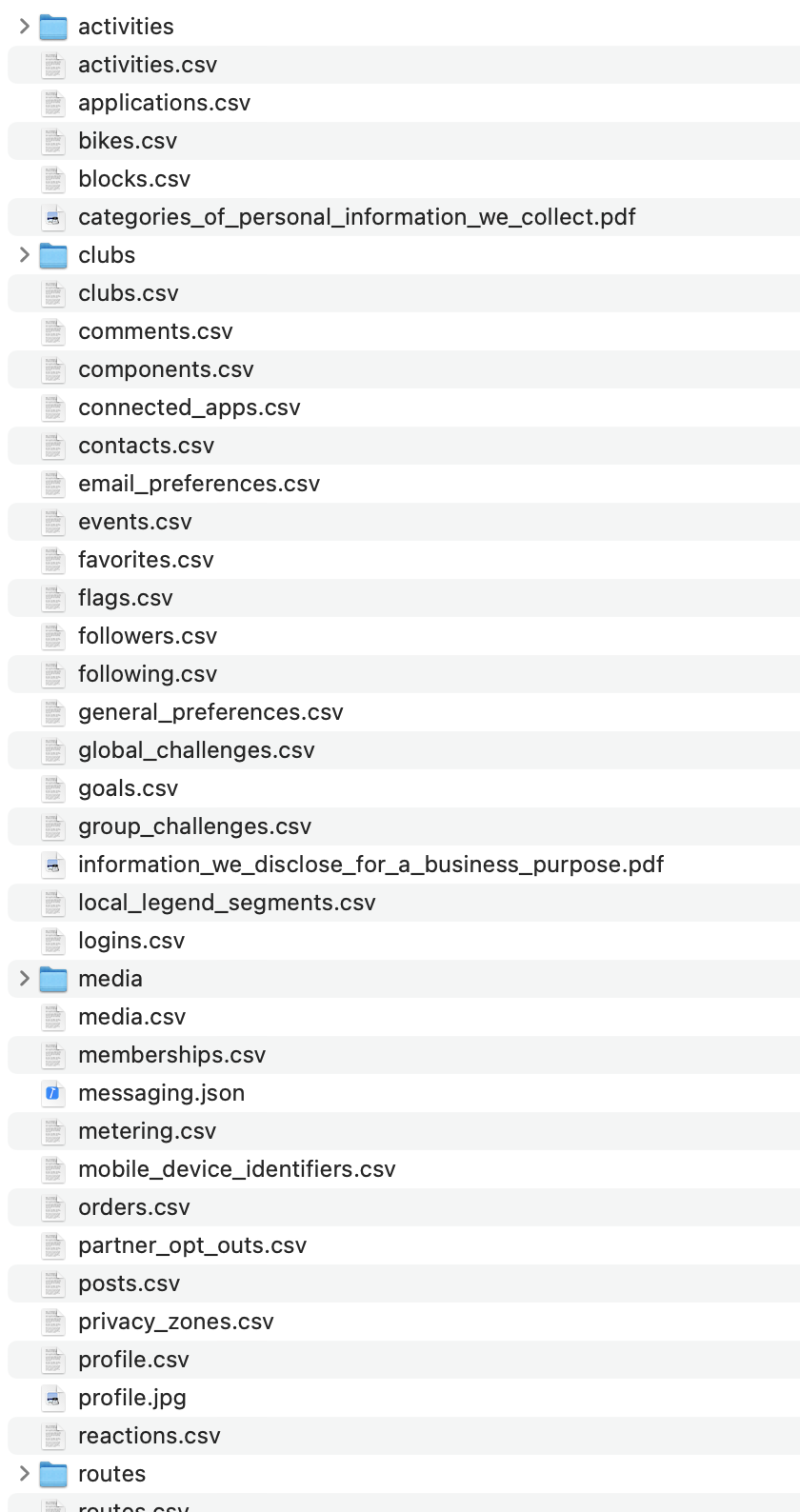
Pulling the data - Bulk download
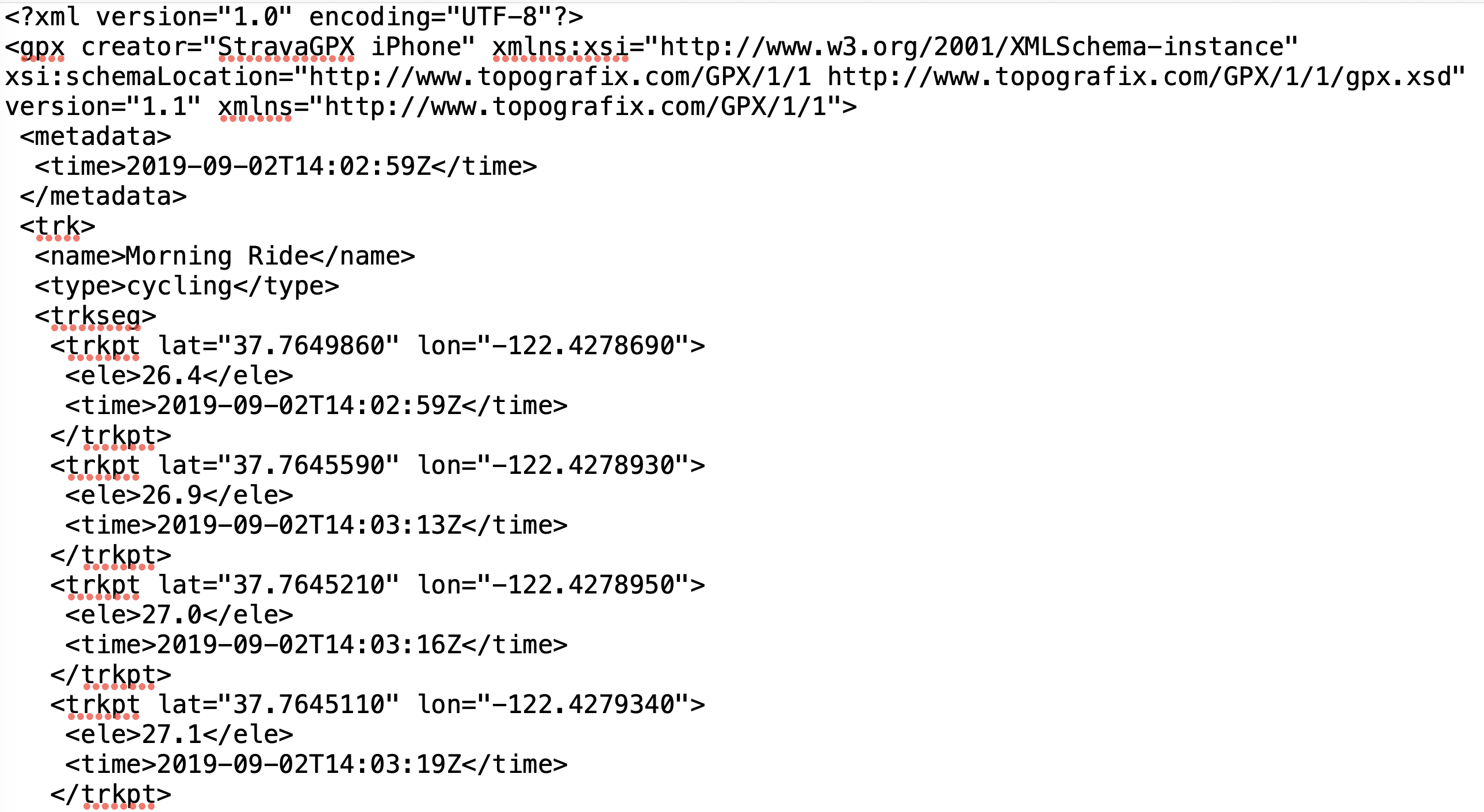
- Bulk download includes folder with all activities in GPX (GPS Exchange Format) files to build your own maps.

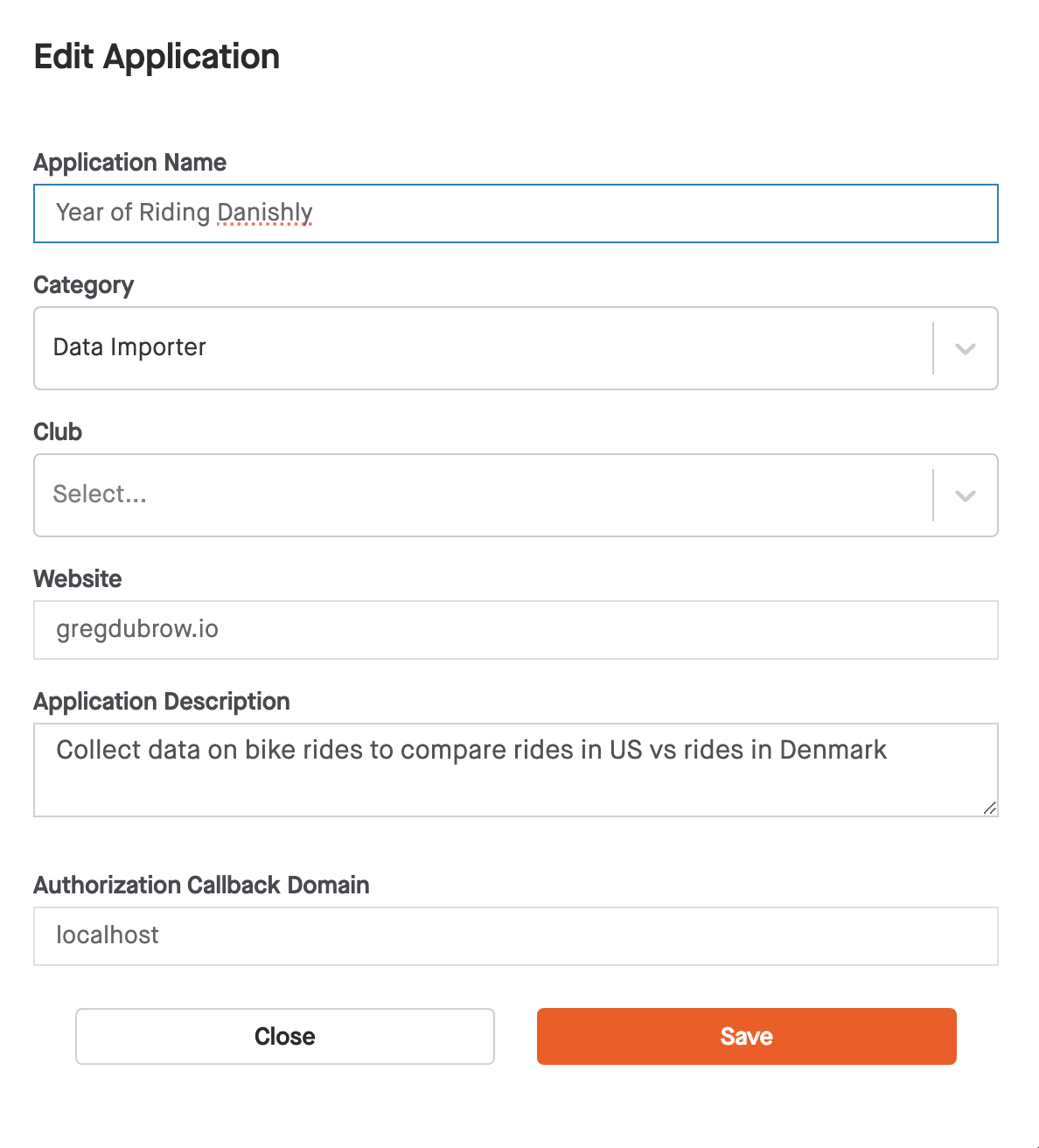
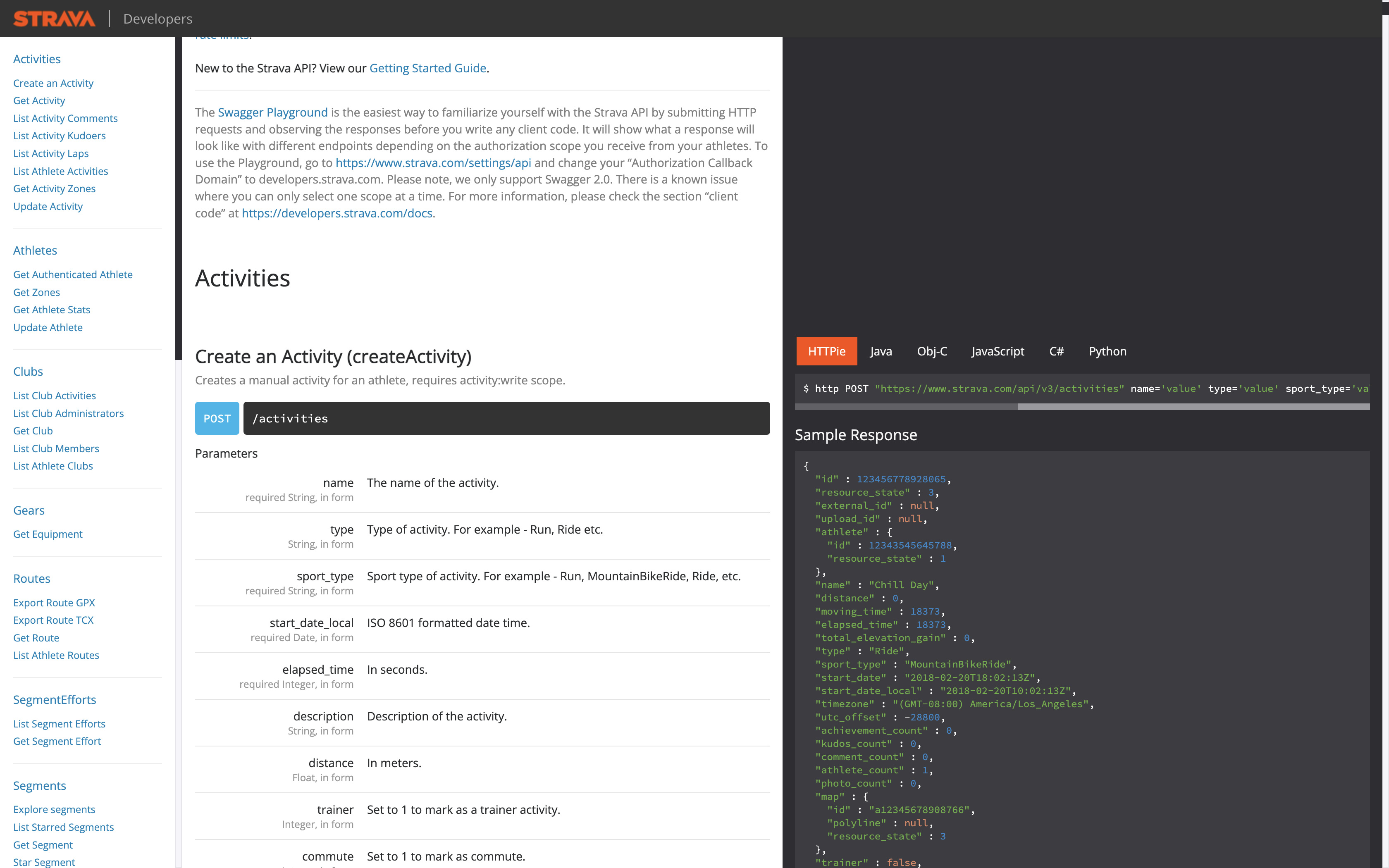
Pulling the data - API
- Sign up in your account, project can be anything you want.
Pulling the data - API
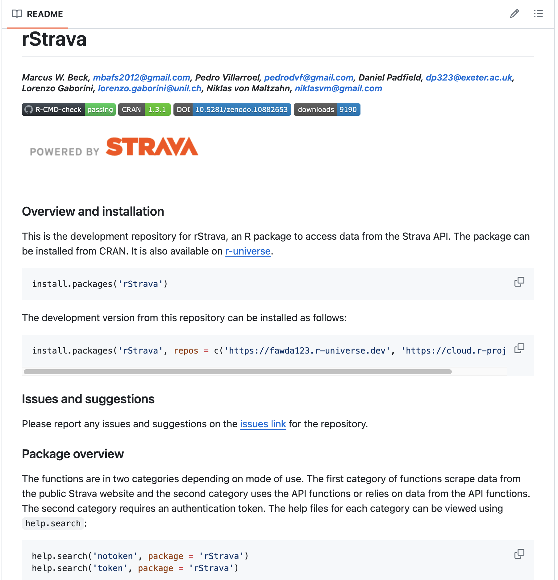
Pulling the data - rStrava package
Let’s load the CSV data
library(tidyverse) # to do tidyverse things
library(tidylog) # to get a log of what's happening to the data
library(janitor) # tools for data cleaning

strava_activities <- readr::read_csv("data/activities.csv") %>%
    clean_names() %>%
    as_tibble() %>%
    rename(elapsed_time = elapsed_time_6, distance = distance_7, max_heart_rate = max_heart_rate_8,
                 relative_effort = relative_effort_9, commute = commute_10, elapsed_time2 = elapsed_time_16,
                 distance2 = distance_18, relative_effort2 = relative_effort_38, commute2 = commute_51)
Too much date & time wrangling
mutate(activity_date = str_replace(activity_date, "Jan ", "January "))

separate('activity_date', paste("date", 1:3, sep="_"), sep=",", extra="drop")

mutate(activity_md = str_trim(date_1))

separate('activity_md', paste("activity_md", 1:2, sep="_"), sep=" ", extra="drop")

mutate(activity_mdy = paste0(date_1, ",", date_2))

mutate(activity_ymd = lubridate::mdy(activity_mdy))

mutate(activity_tz = case_when(activity_ymd >= "2022-06-28" ~ "Europe/Copenhagen",
    TRUE ~ "US/Pacific"))
Ok, time to try the API…or wait…is there a package?
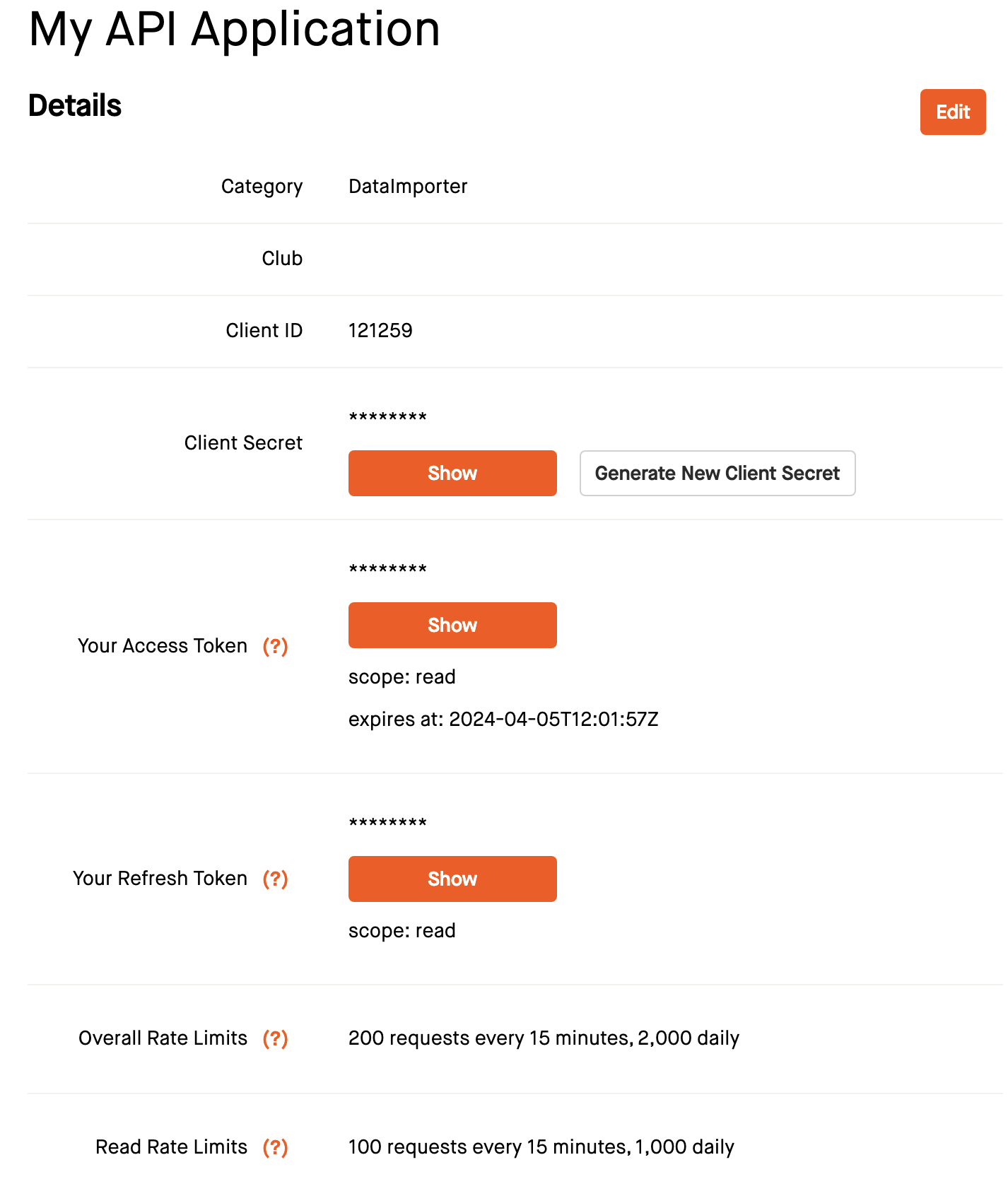
Using the rStrava package - Authorization
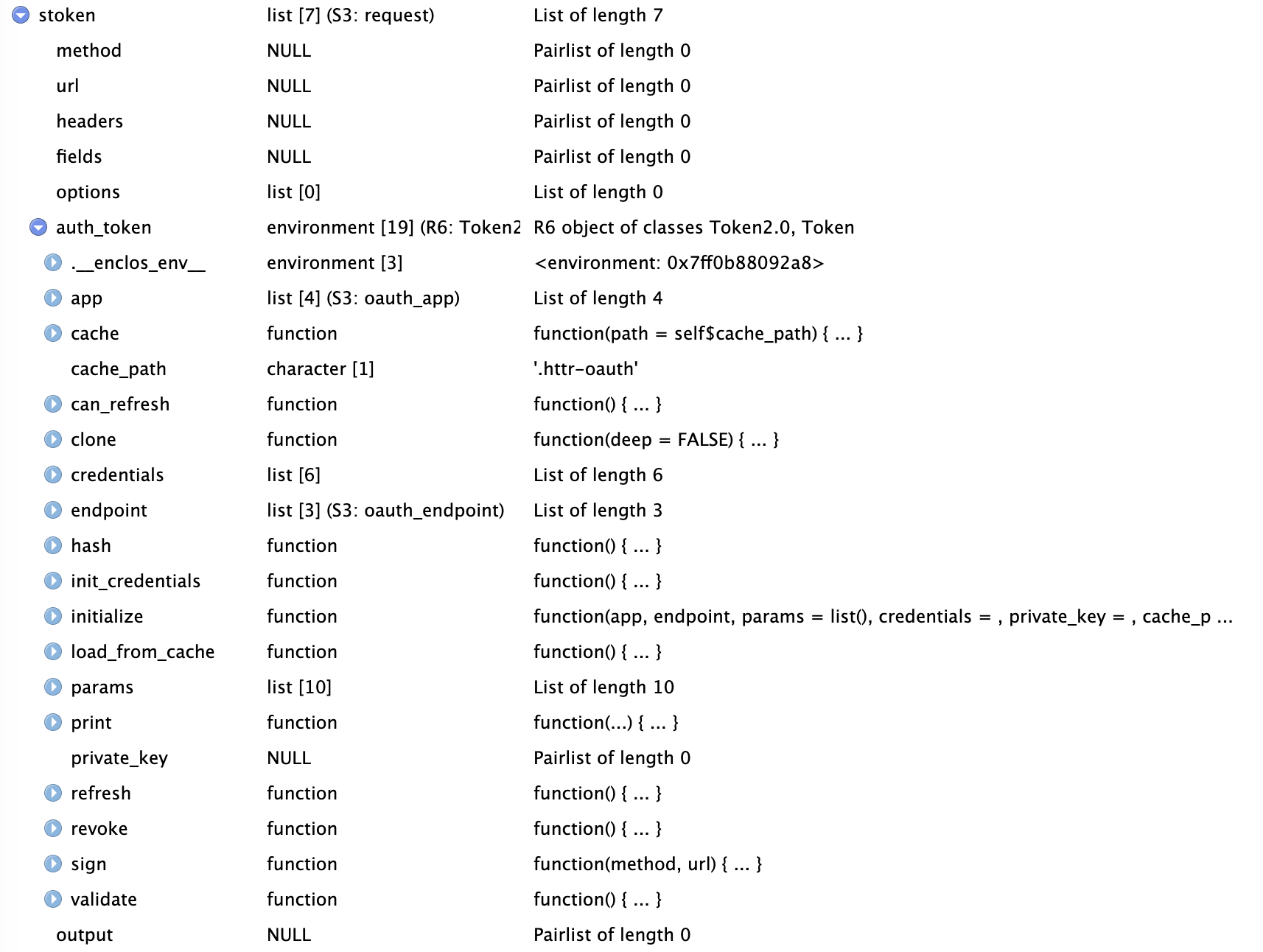
In a separate file called stoken.r, I create the access token to call in the script that pulls the data.
library(rStrava)
app_name <- 'Year of Riding Danishly' # chosen by user
app_client_id  <- '---' # an integer, assigned by Strava
app_secret <- '---' # an alphanumeric secret, assigned by Strava

# create the authentication token - cache = TRUE saves it in the working directory
stoken <- httr::config(token = strava_oauth(
    app_name, app_client_id, app_secret,
    app_scope="activity:read_all", cache = TRUE))
stoken object is a list:
Using the rStrava package - Get the data
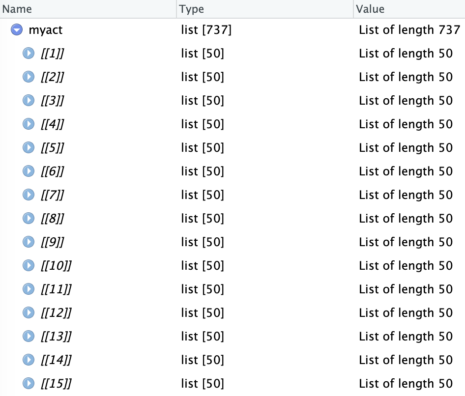
## call the OAuth access token
stoken <- httr::config(token = readRDS('.httr-oauth')[[1]])

## invoke stoken to get data
myact <- get_activity_list(stoken)
Returns a list of activities requested
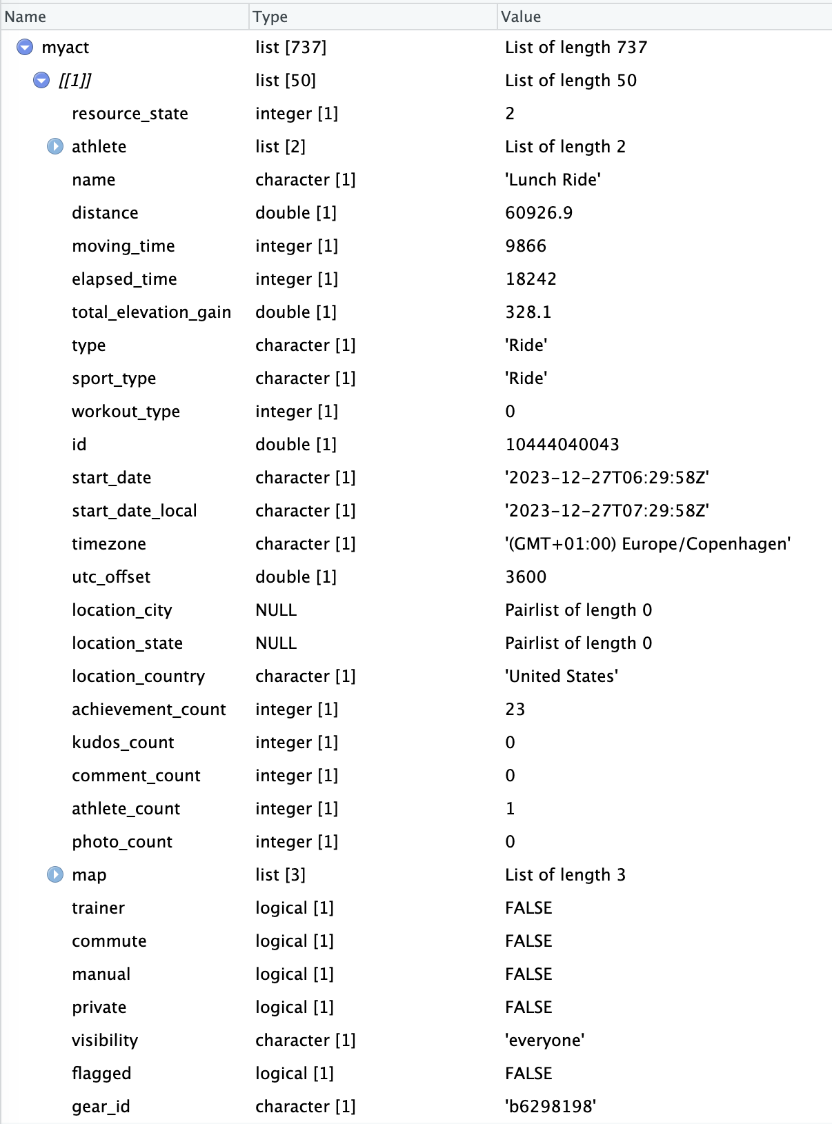
Using the rStrava package - Get the data
 act_data <- compile_activities(myact) %>%
    as_tibble() %>%
    glimpse()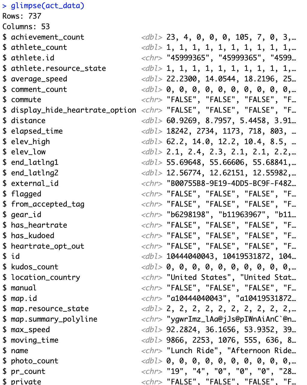
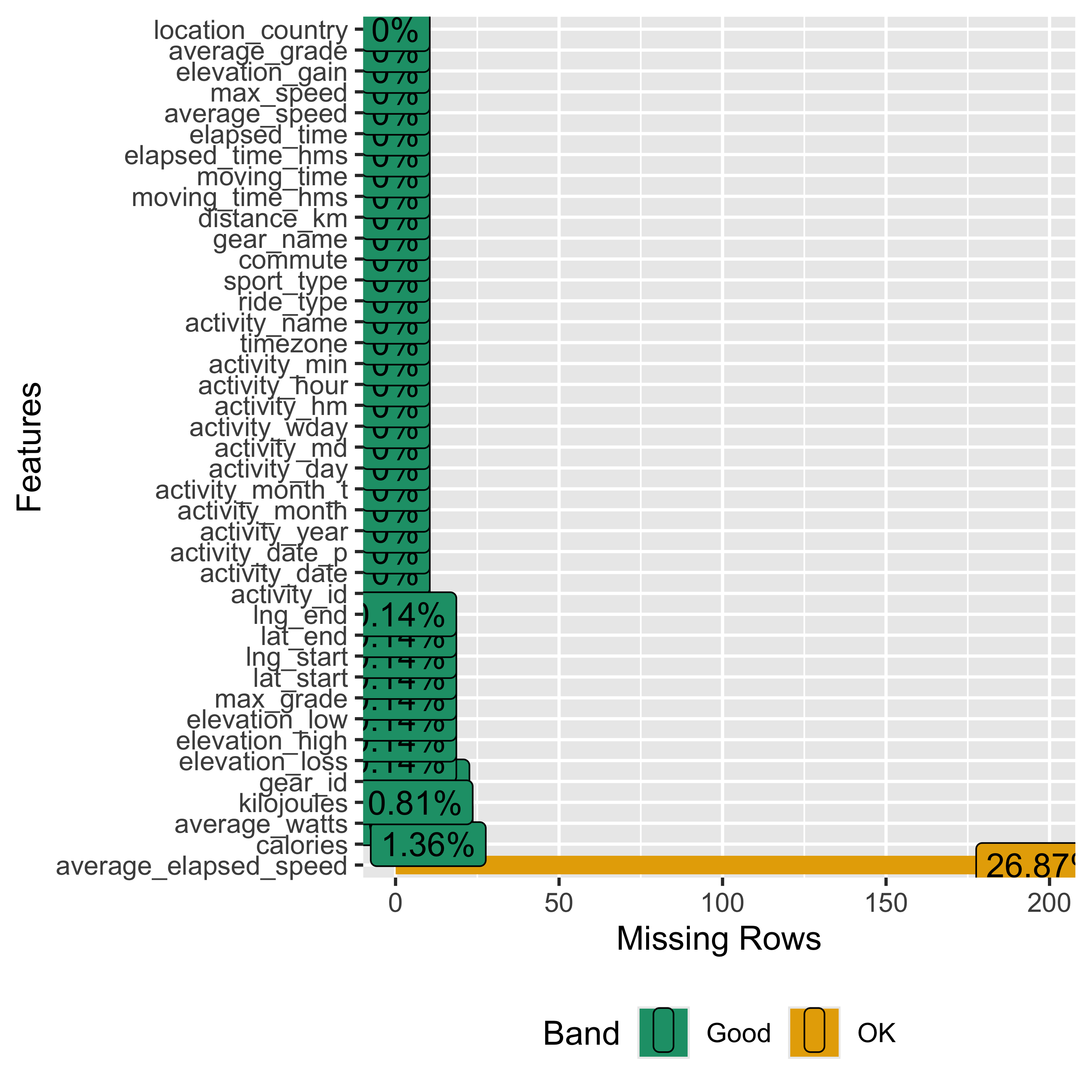
Let’s do some EDA
library(DataExplorer) # for EDA

plot_intro(strava_data)
plot_missing(strava_data)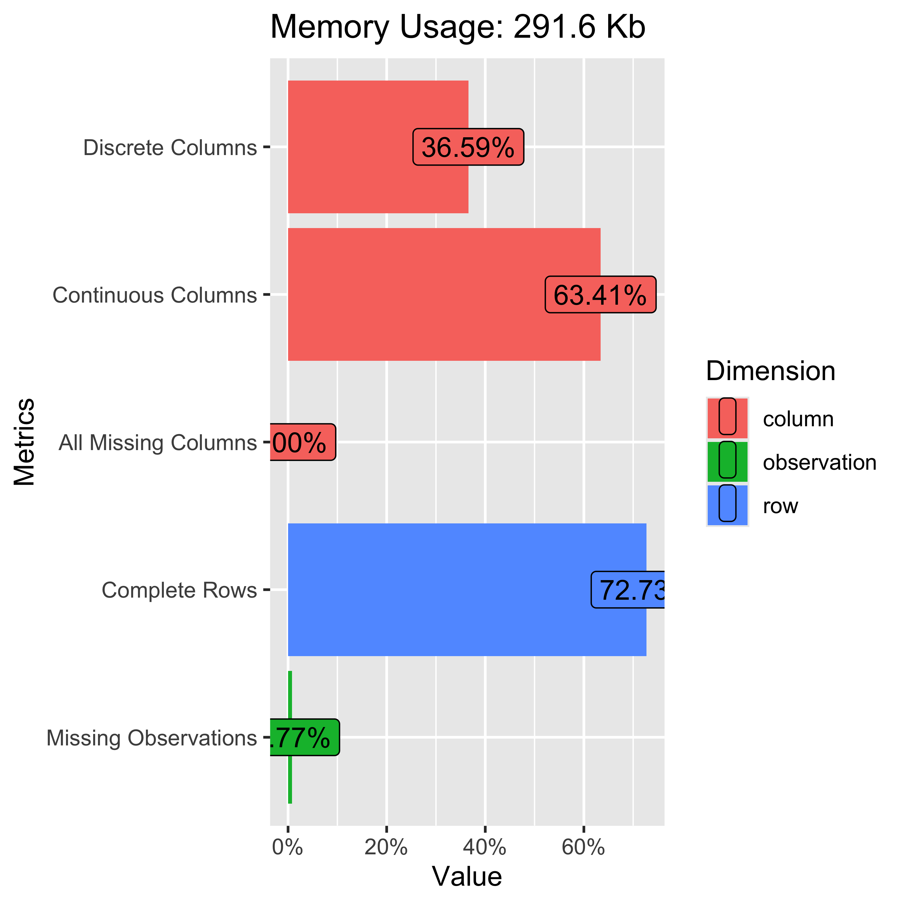
Let’s do some EDA - Correlations!
strava_data %>%
    select(distance_km, elapsed_time, moving_time, max_speed, average_speed, elevation_gain, elevation_loss, elevation_low,
                 elevation_high, average_grade, max_grade, average_watts, calories, kilojoules) %>%
    filter(!is.na(average_watts)) %>%
    filter(!is.na(calories)) %>%
    plot_correlation(maxcat = 5L, type = "continuous", geom_text_args = list("size" = 4))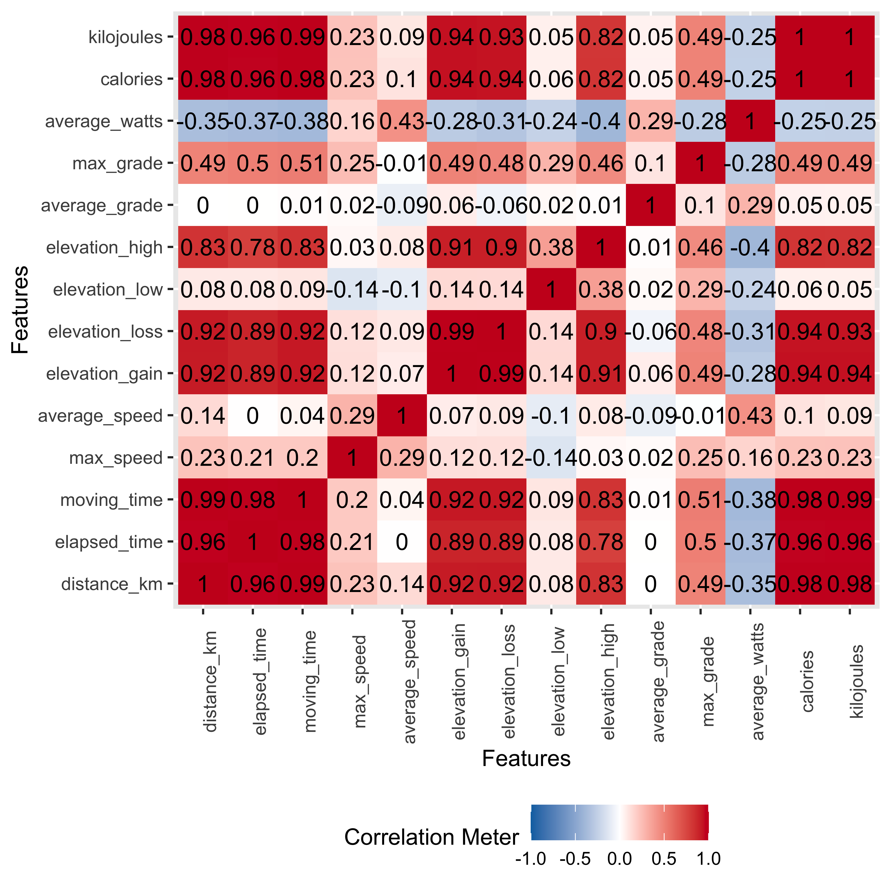
So what do we see here?
Most of the relationships are positive, some with expectedly near 1:1 relationships, such as distance (in km) and total time for the ride.
Average speed is positively correlated with distance but the relationship is only at 0.14, the weakest of all positive associations with distance. Average speed correlations are low…near 0, for total elevation gain and negative the higher the average grade of the ride.
Averge watts, or weighted power output for the ride, has mostly negative correlations. Longer rides in time or distance meant a lower average power per ride segment.
We’ll keep these correlations in mind when looking at the scatterplots and then later considering the regression results.
More EDA - Scatterplots!
-
DataExplorerhas functionality for scatterplots, but each call only allows for one comparison y-axis variable & not much customization to the output, like a smoothing line.
plot_scatterplot(strava_data_filter, by = "distance_km", nrow = 6L)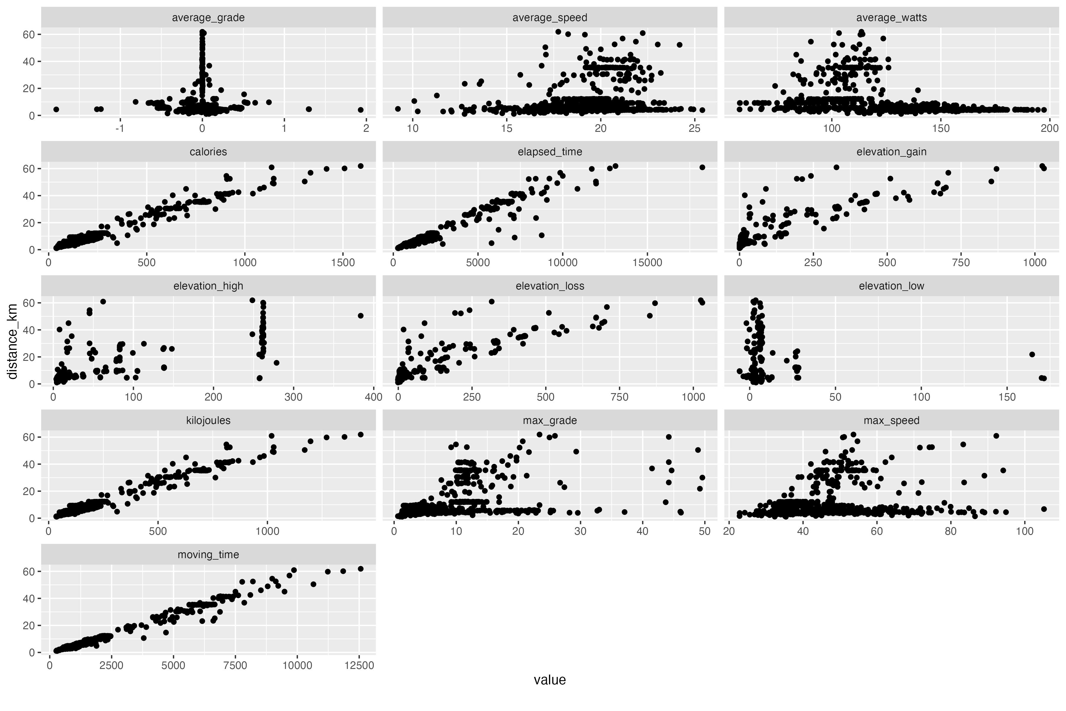
More EDA - Better scatterplots!
## 1st plot call - distance as y axis
patchwork::wrap_plots(
    map2(c("elapsed_time", "moving_time", "average_speed","average_watts", "calories", "kilojoules"),
             c("distance_km", "distance_km", "distance_km", "distance_km", "distance_km", "distance_km"),
             ~plot_scatter_lm(data = strava_activities_rides, var1 = .x, var2 = .y, pointsize = 3.5) +
                theme(plot.margin = margin(rep(15, 4)))))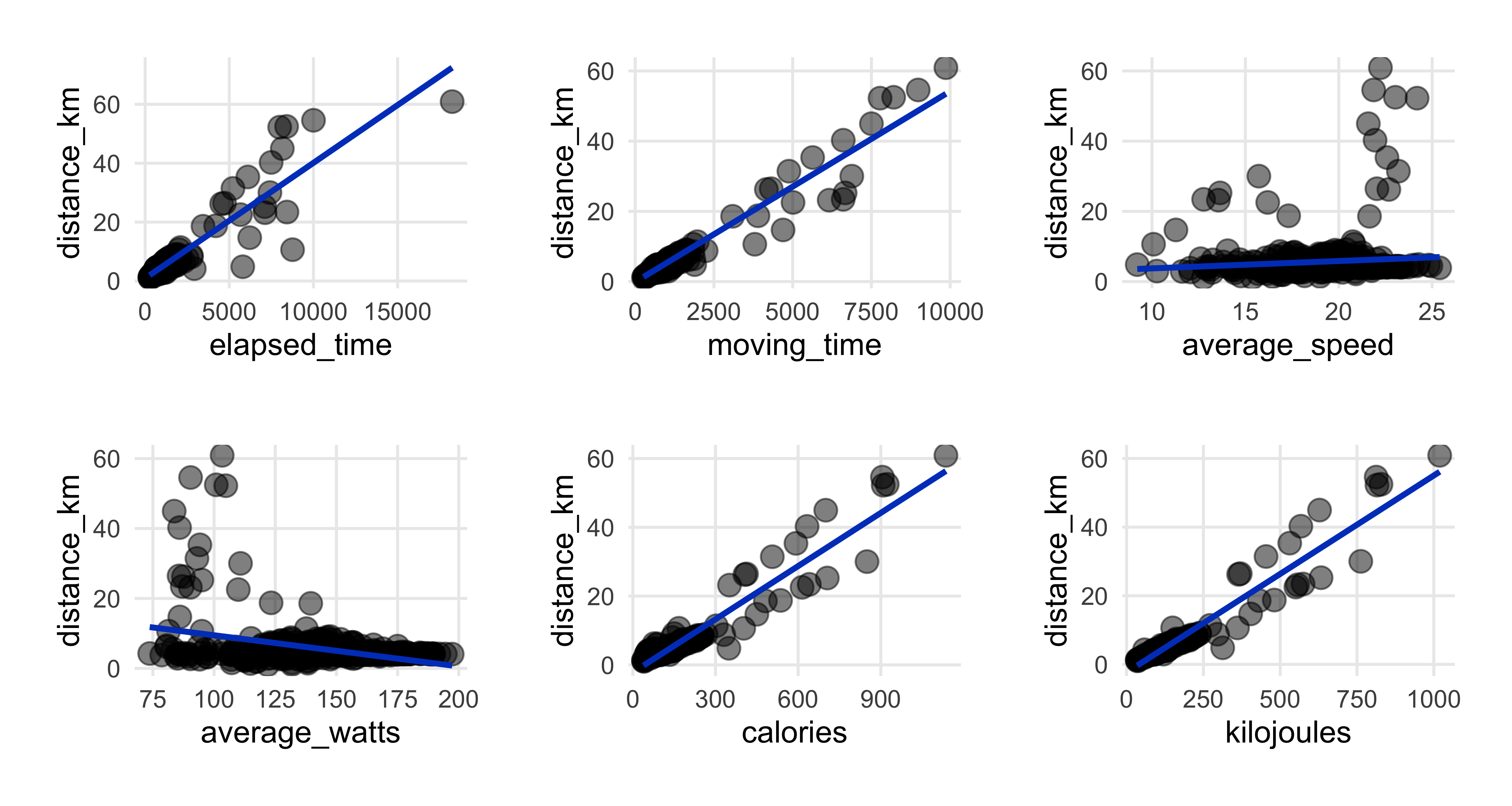
Confirms what we saw in the correlation heatmap & displays ride distributions.
Positive and almost 1:1 relationships between distance and both time measures, elapsed and moving.
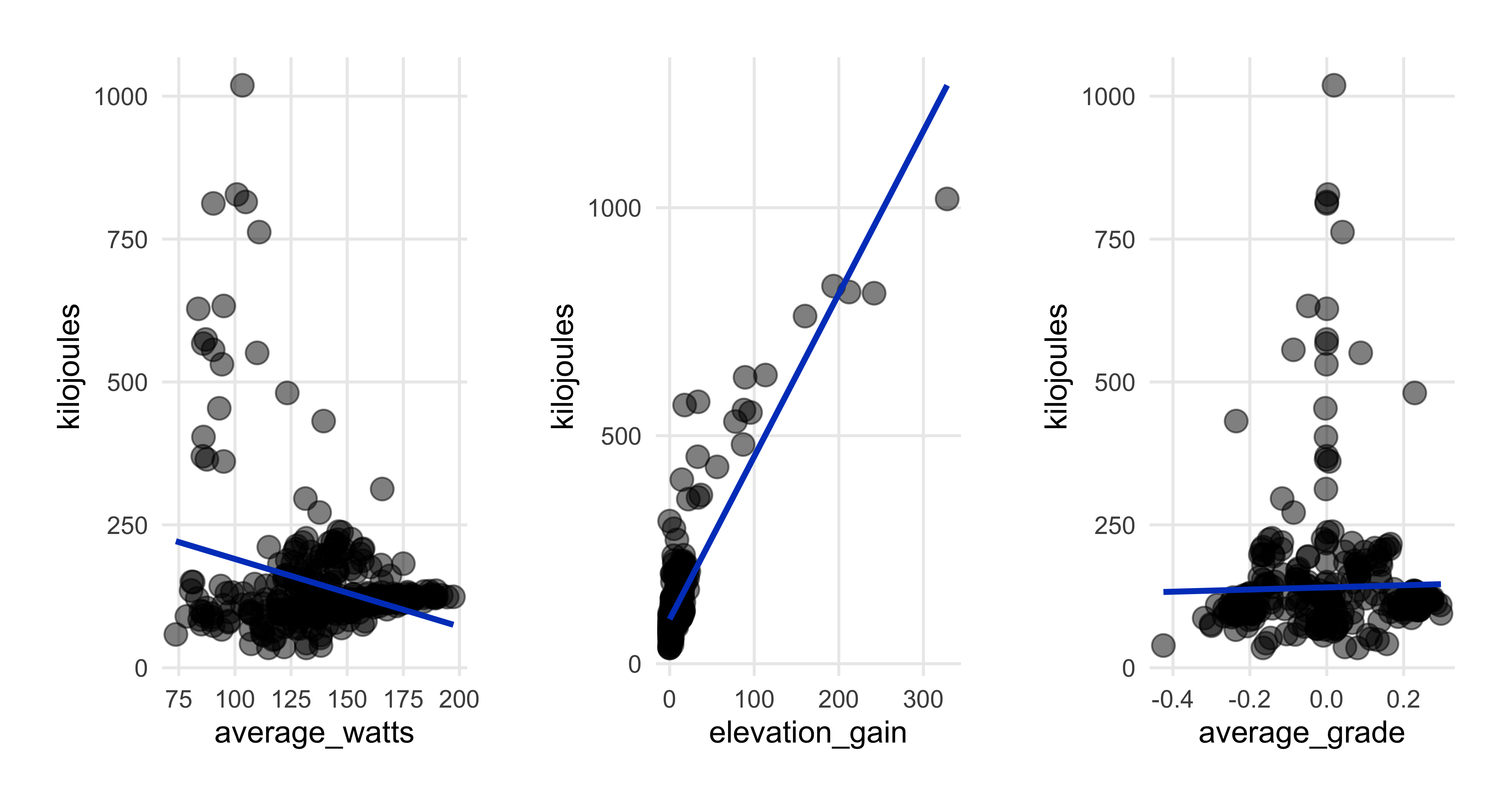
Negative association with watts that we saw in the correlations. Making a note to take a closer look at how much an effect watts has later on in the regression section.
Note the outlier ride of 60km and an elapsed time of more than 15,000 seconds…more about that one later.
A few more scatterplots
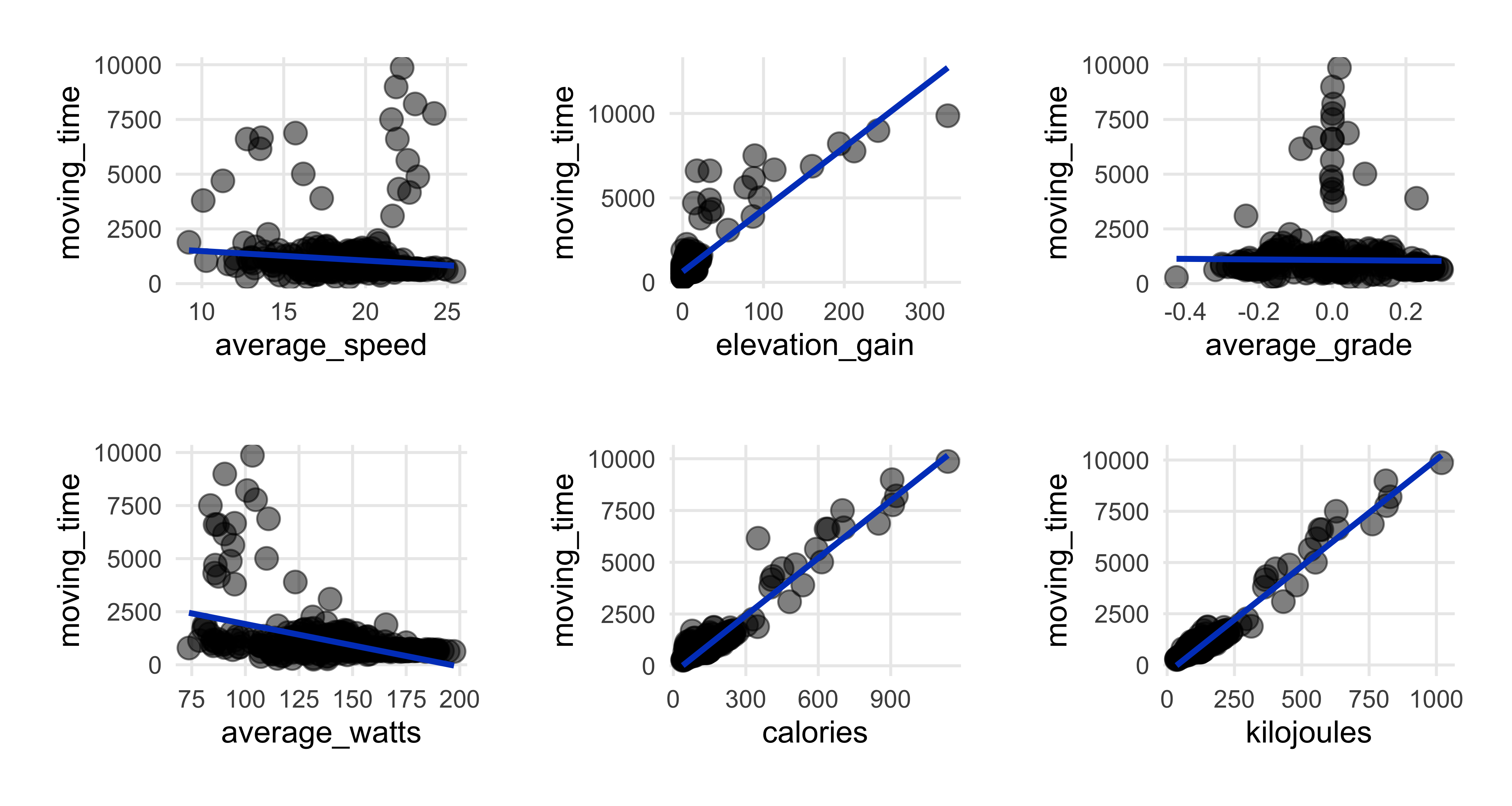
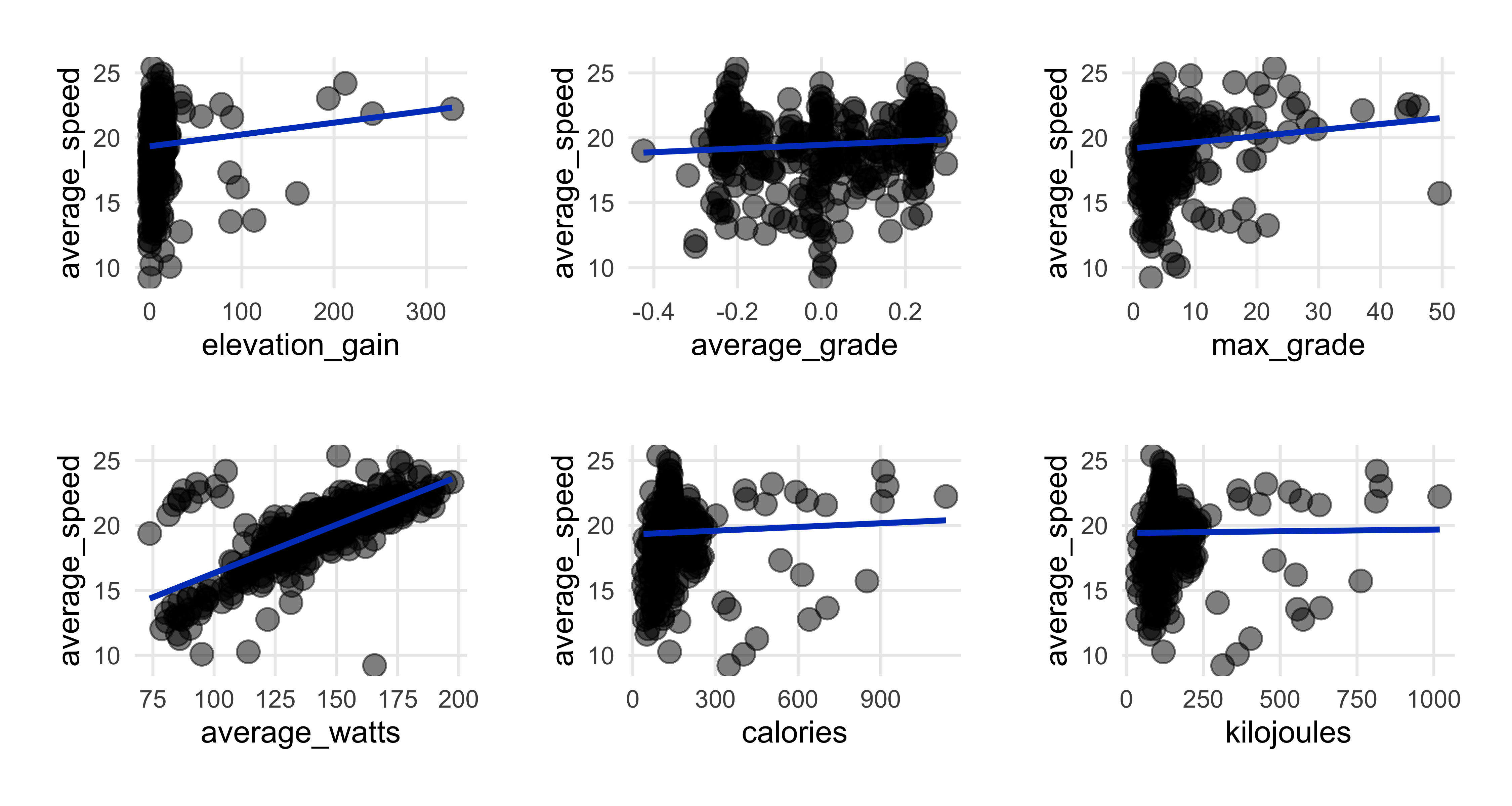
- Average speed decreases as ride time goes up (top left plot)…makes sense.
- Expended more energy (calories & kilojoules) as ride time increased (top left).
- Speed & watts had strong relationship (top right), as we saw in correlation heatmap.
- Surprised energy output has weak association with average speed; perhaps here in flat Denmark there’s only so much energy burn I can hit.
- Strong relationship between kilojoules & elevation.
Tables with gt
library(gt)
sumtable %>%
    select(rides, km_total, elev_total, time_total1, time_total2, cal_total, kiloj_total) %>%
    gt() %>%
    fmt_number(columns = c(km_total, elev_total, cal_total, kiloj_total), decimals = 0) %>%
    cols_label(rides = "Total Rides", km_total = "Total Kilometers",
                         elev_total = md("Total Elevation *(meters)*"),
                         time_total1 = md("Total Time *(hours/min/sec)*"),
                         time_total2 = md("Total Time *(days/hours/min/sec)*"),
                         cal_total = "Total Calories", kiloj_total = "Total Kilojoules") %>%
    cols_align(align = "center", columns = everything()) %>%
    tab_style(style = cell_fill(color = "grey"), locations = cells_body(rows = seq(1, 1, 1))) %>%
    tab_style( style = cell_text(align = "center"), locations = cells_column_labels(
            columns = c(rides, km_total, elev_total, time_total1, time_total2, cal_total, kiloj_total))) %>%
tab_header(title = md("My Year of Riding Danishly<br>*Ride Totals*")) 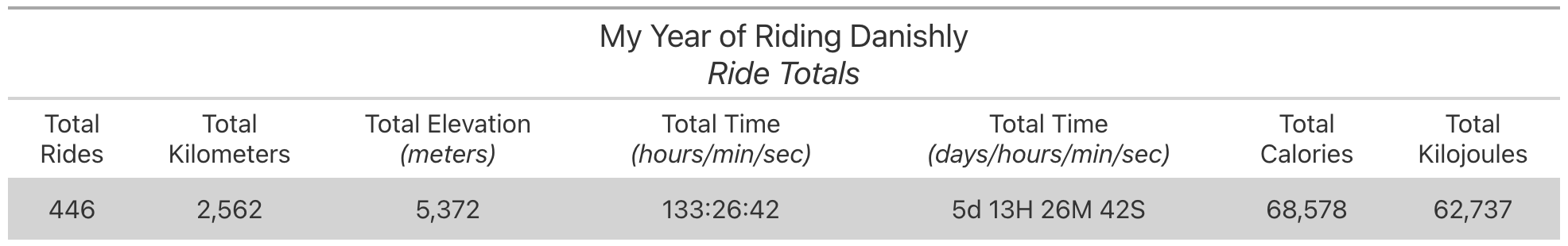
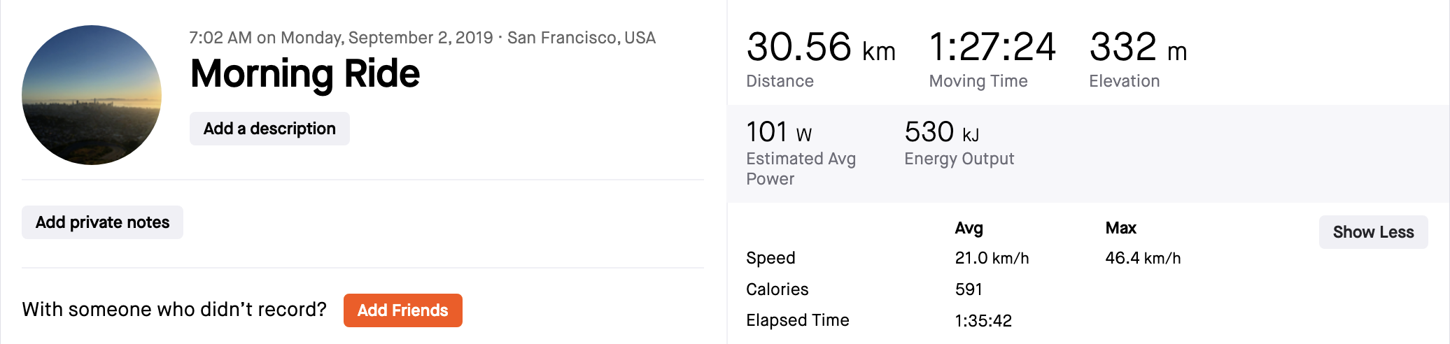
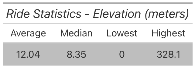
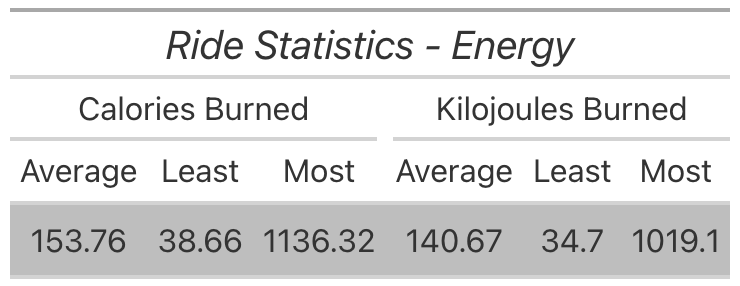
- For the year, more than 440 rides covering 2,500 kilometers.
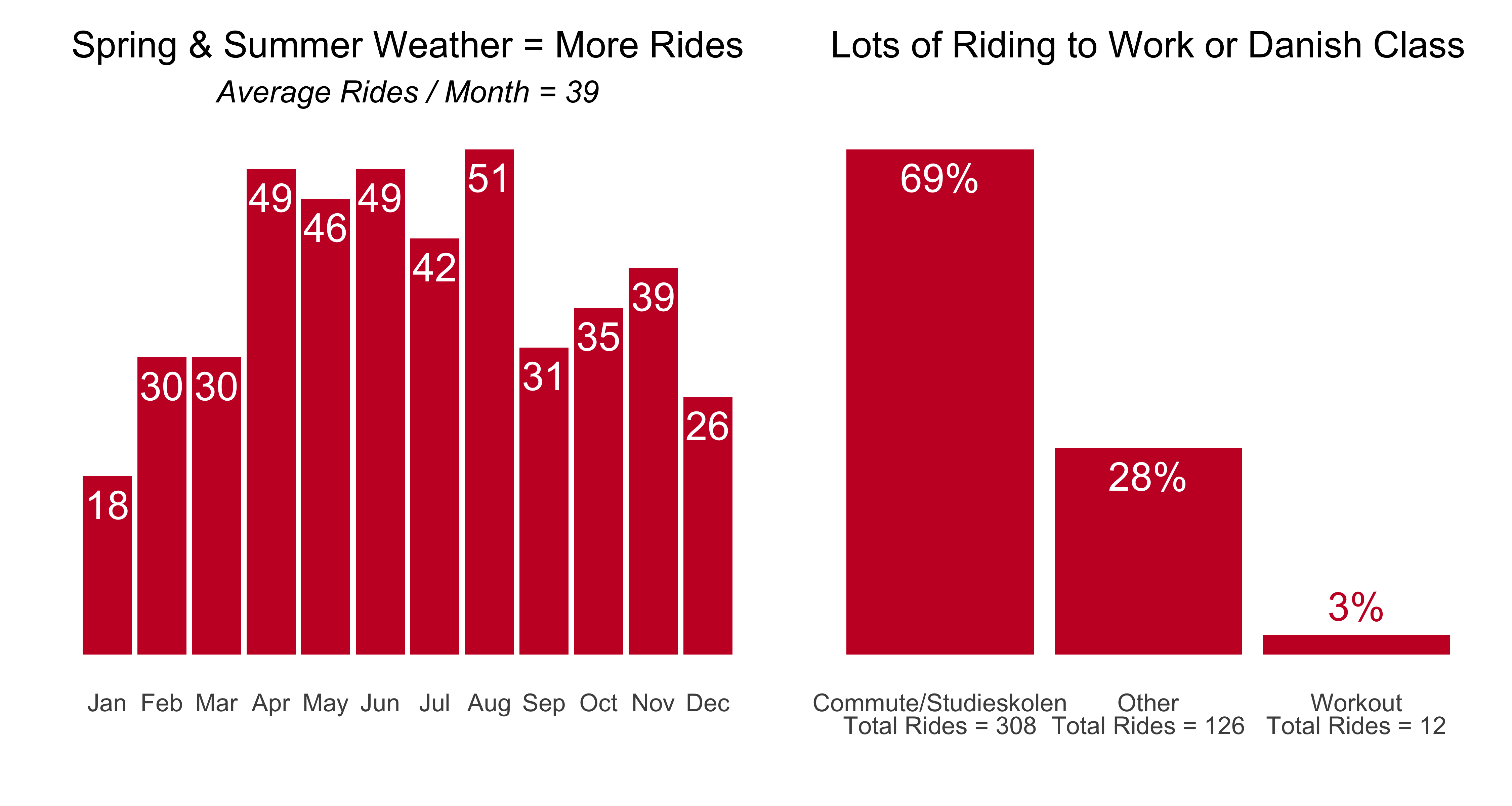
- I spent the equivalent of more than 5 days on the bike, and burned 60,000+ units of energy. Which means on average, every day I did 1.2 rides,and went about 7 km, a few km more than the average Copenhagener. (It occurs to me know that I didn’t make a count for how many days of the year I rode…an edit to come perhaps…)
Tables with gt
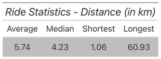
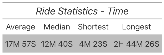
- The rides spanned 1 km to 60 km, with the average & median ride around 4-5km, which makes sense given that my work commute was a bit over 4km and rides to Danish class were ~4km or ~6km depending on location.
- The elevation stats are what you’d expect for Denmark, and the average ride burned 140-150 units of energy.
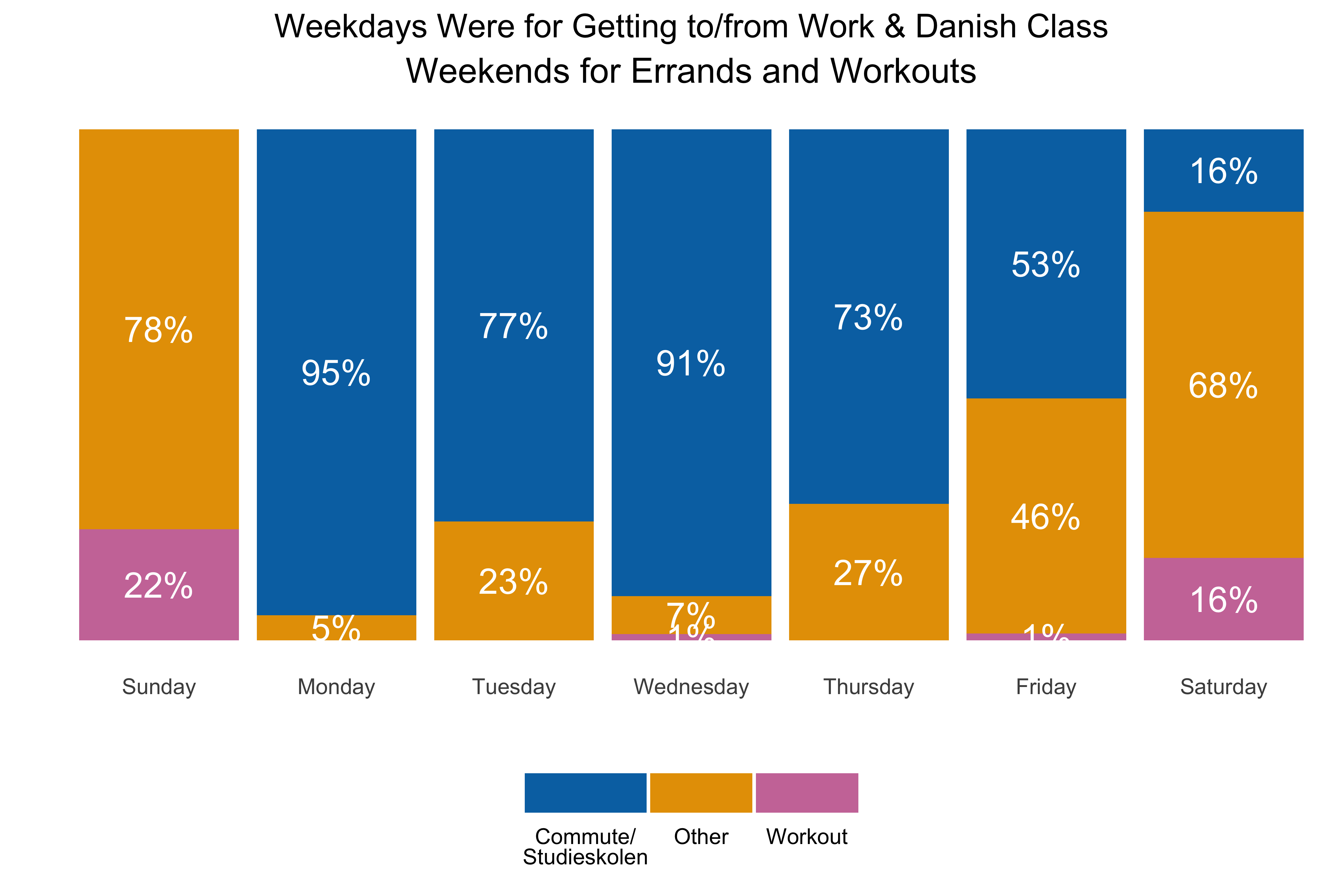
Let’s make some charts with ggplot2
Let’s make some charts with ggplot2
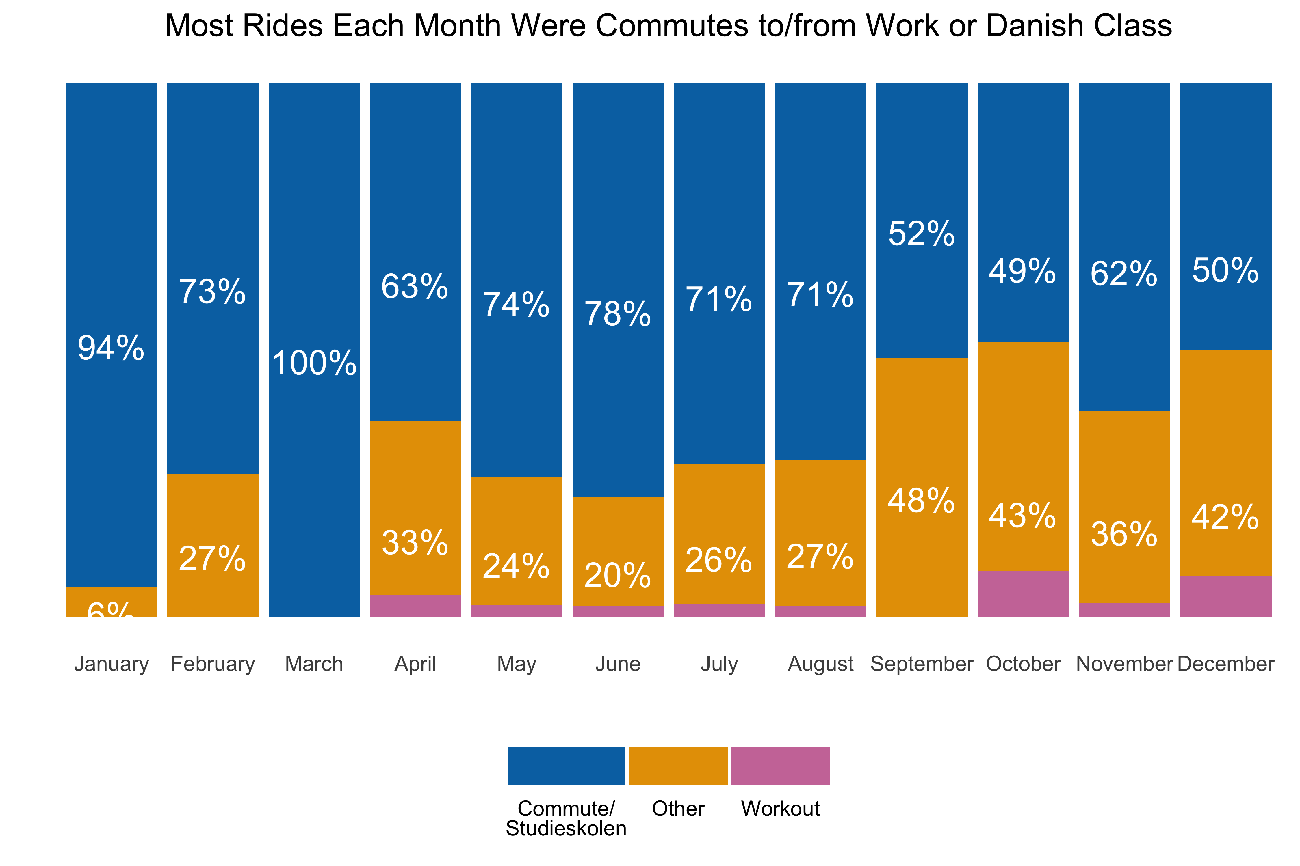
Let’s make some charts with ggplot2
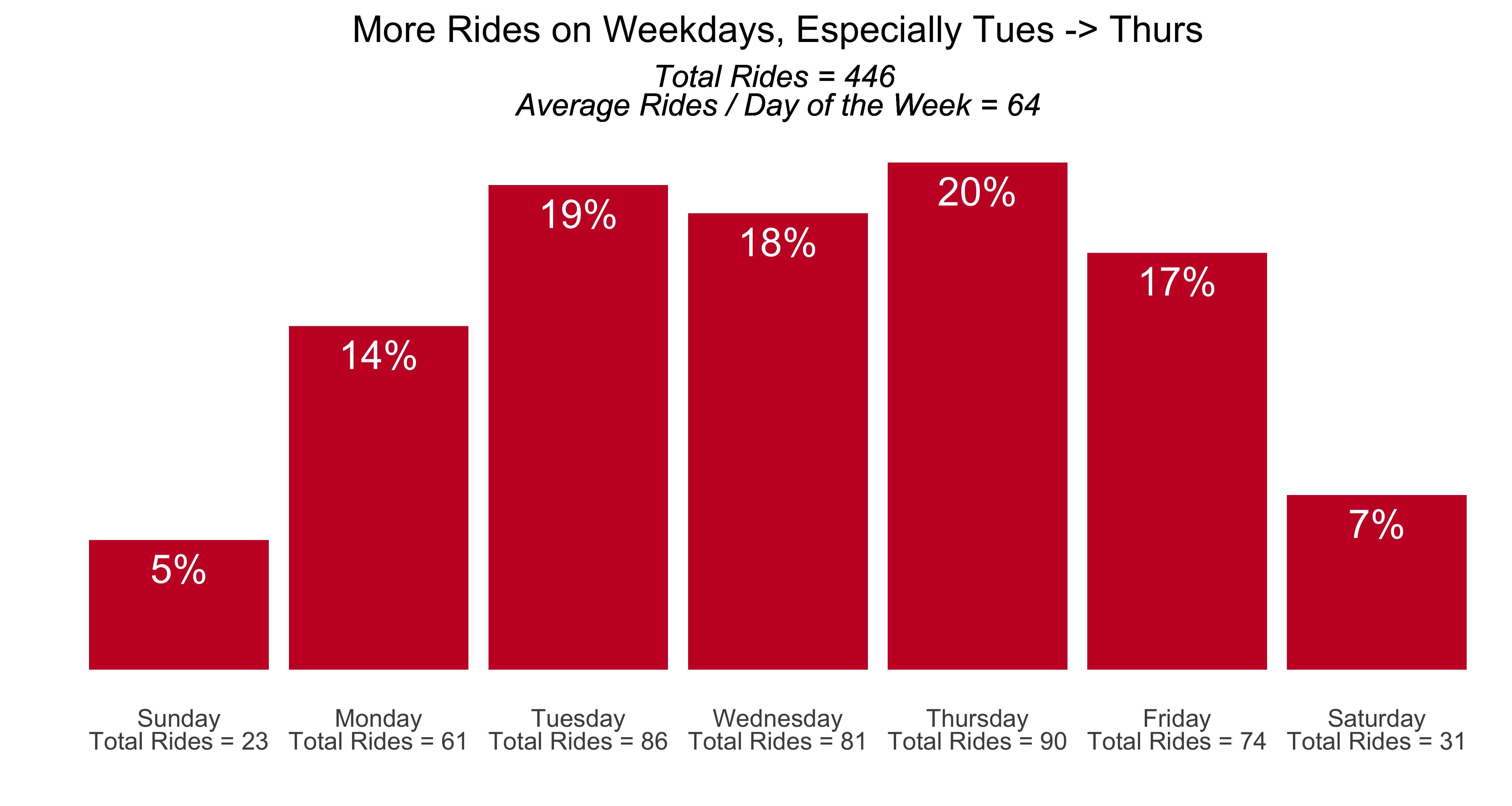
Let’s make some charts with ggplot2
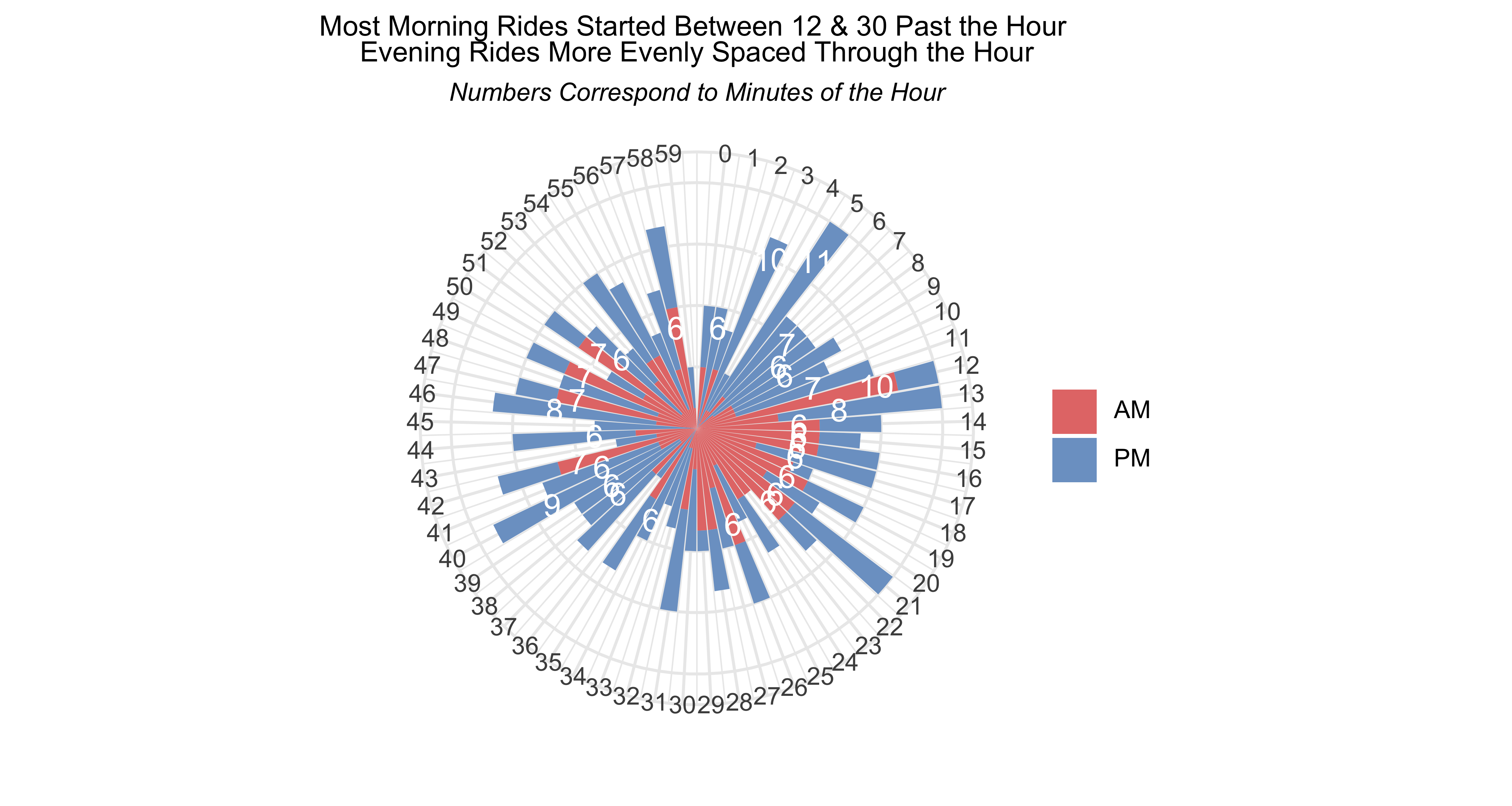
Oohh…radial plots
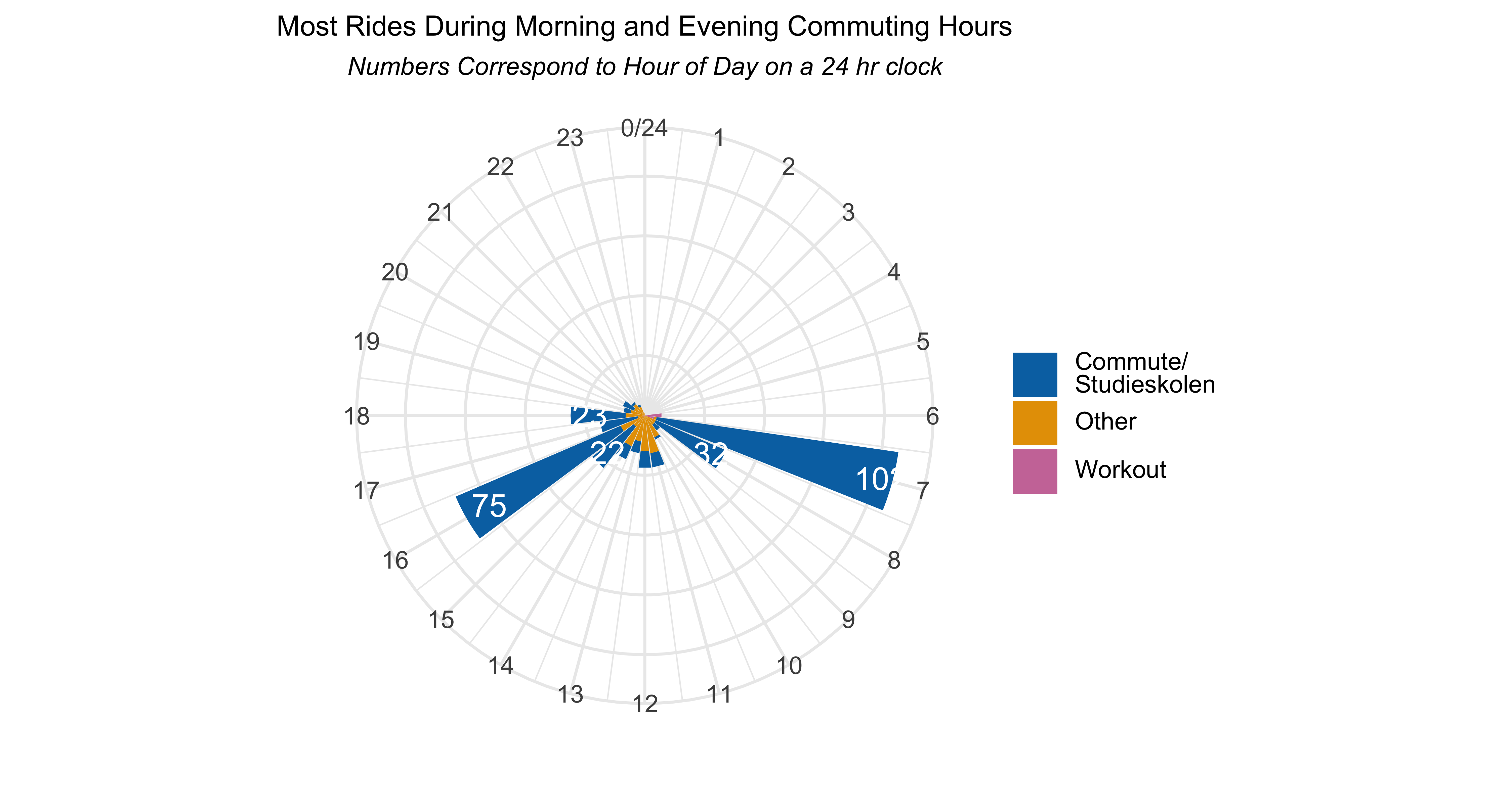
Oohh…radial plots
What do the models tell us?
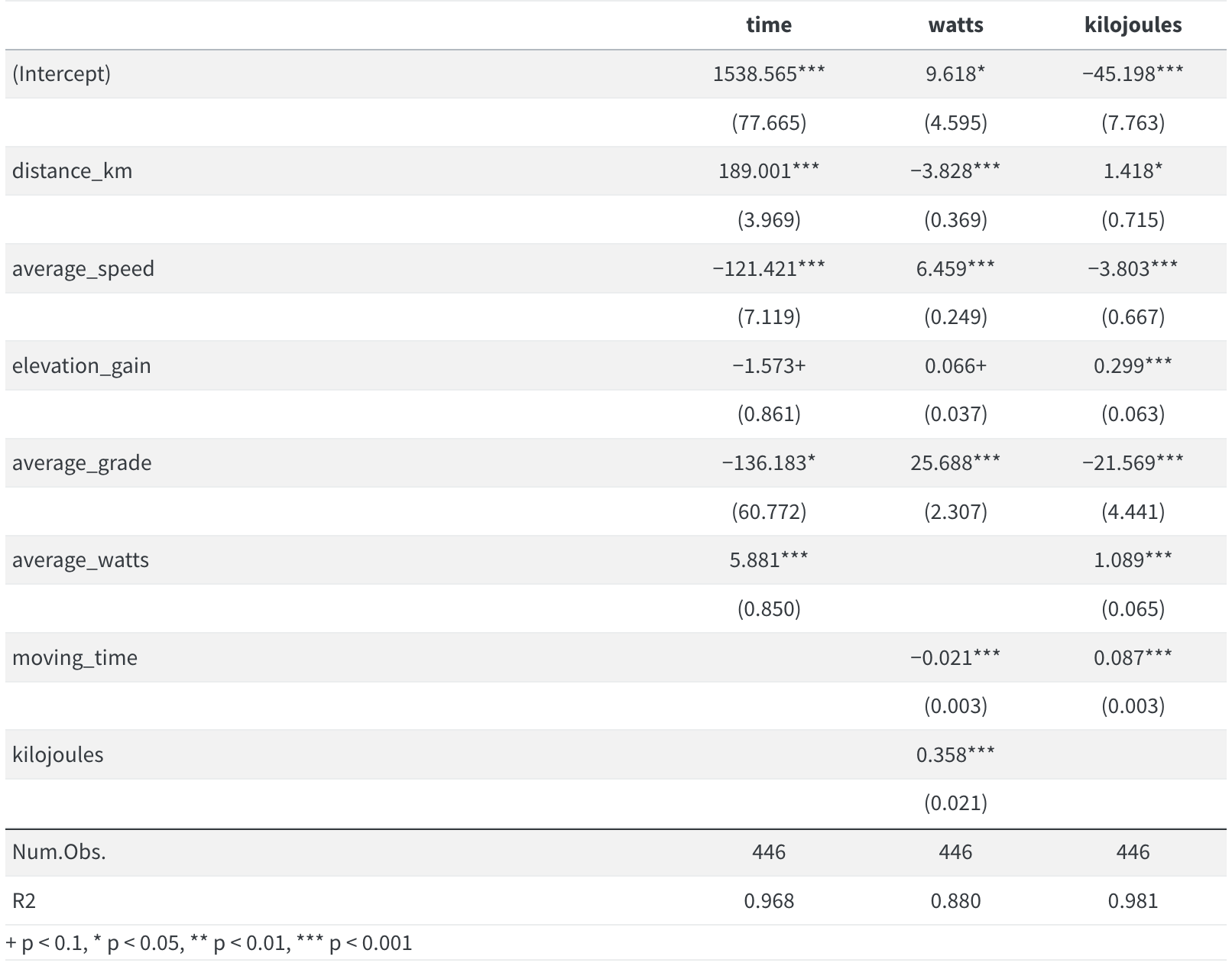
In the time model, each extra kilometer per ride added almost 190 seconds, or 3 minutes, to the ride. Each km/hour or average speed took about 2 minutes off a ride. It’s a bit counter-intuitive however that steeper average grades resulted in shorter rides. I’d need to dig deeper into the data to see why that might be happening.
For the watts model the largest effect size was average_grade, which makes sense…the steeper the ride the more power I needed to do it. Though oddly, grade had a negative effect on kilojoules burned.
Overall the models were robust, each explaining well over 80% of variance.
But before we’re fully satisfied with the models, let’s do a quick check for colinearity…
Colinearity using car
# create the data objects for the models
colin_time <- stack(car::vif(ride_models$time))
colin_time <- stack(car::vif(ride_models$time))
colin_watts <- stack(car::vif(ride_models$watts))
colin_joules <- stack(car::vif(ride_models$kilojoules))

# show the results using gt (only showing the call for time model)
colin_time %>%
    gt() %>%
    tab_header(title = "Colinearity - Time Model")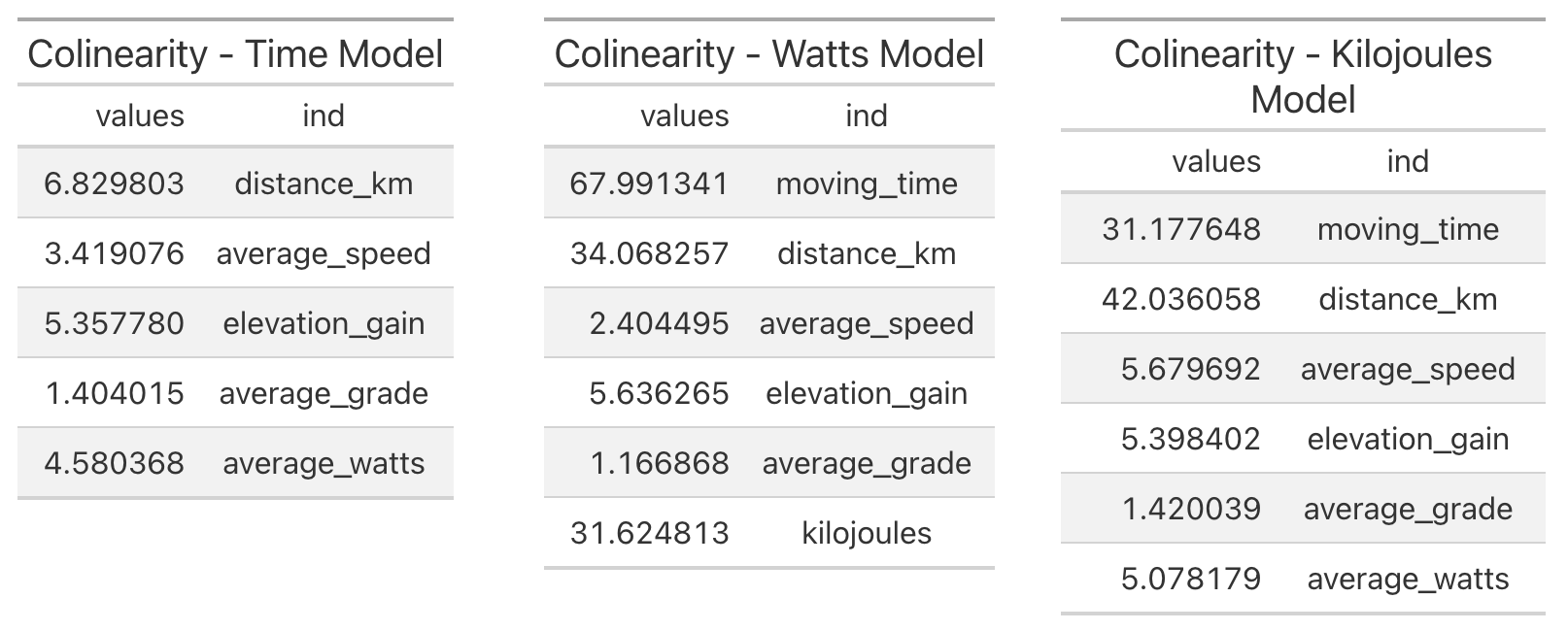
There’s some problematic colinearity with moving_time and distance_km in the watts and kilojoules models, so let’s redo models removing the variables with most colinearity.
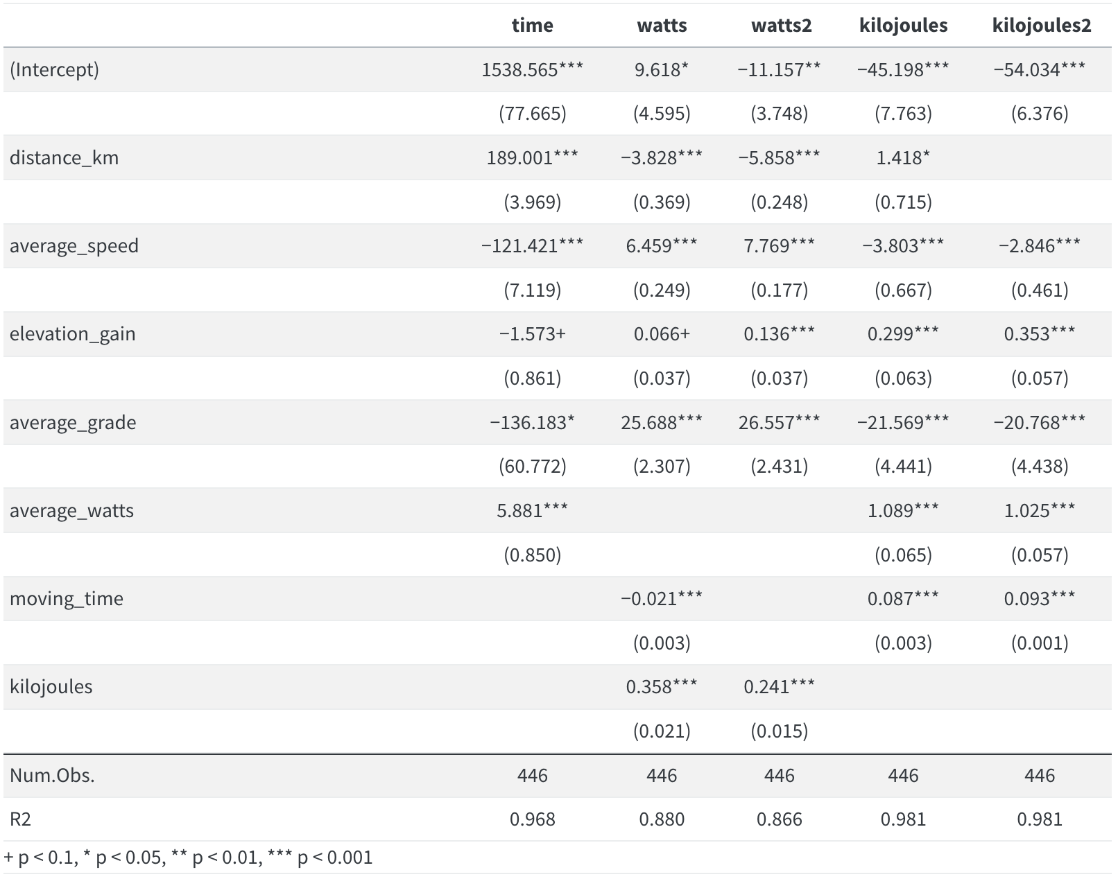
Model run v2
- No need to show the code again, here’s the model summary table, and I included the original models and those with colinear variables removed so we could see the difference.
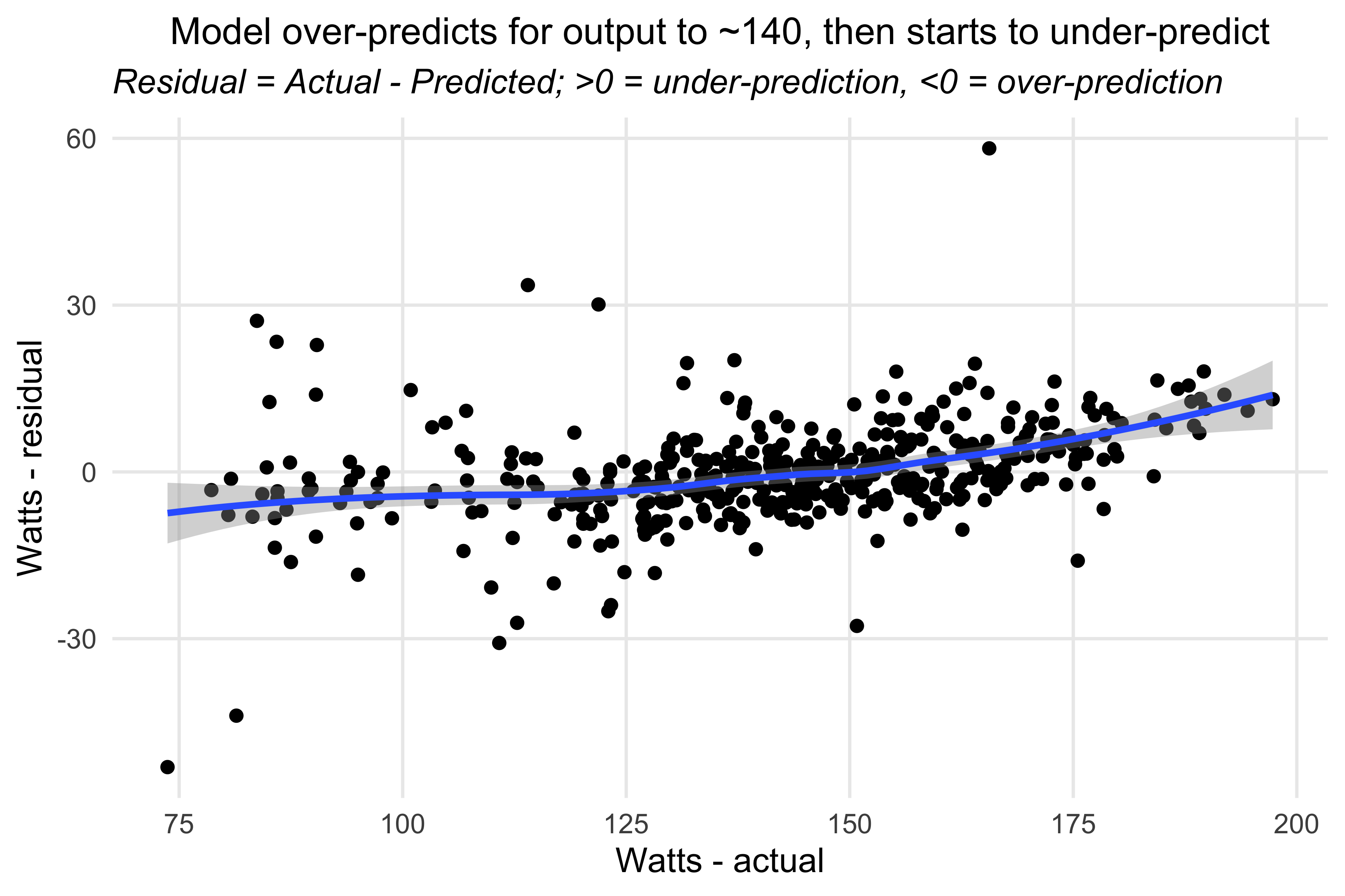
Plotting the residuals
- Slight deviation from the blog post, where I plotted predicted v actual. Here I want to plot the residuals (actual minus predicted) against the actuals to check for heteroscedasticity (variance of errors not constant).
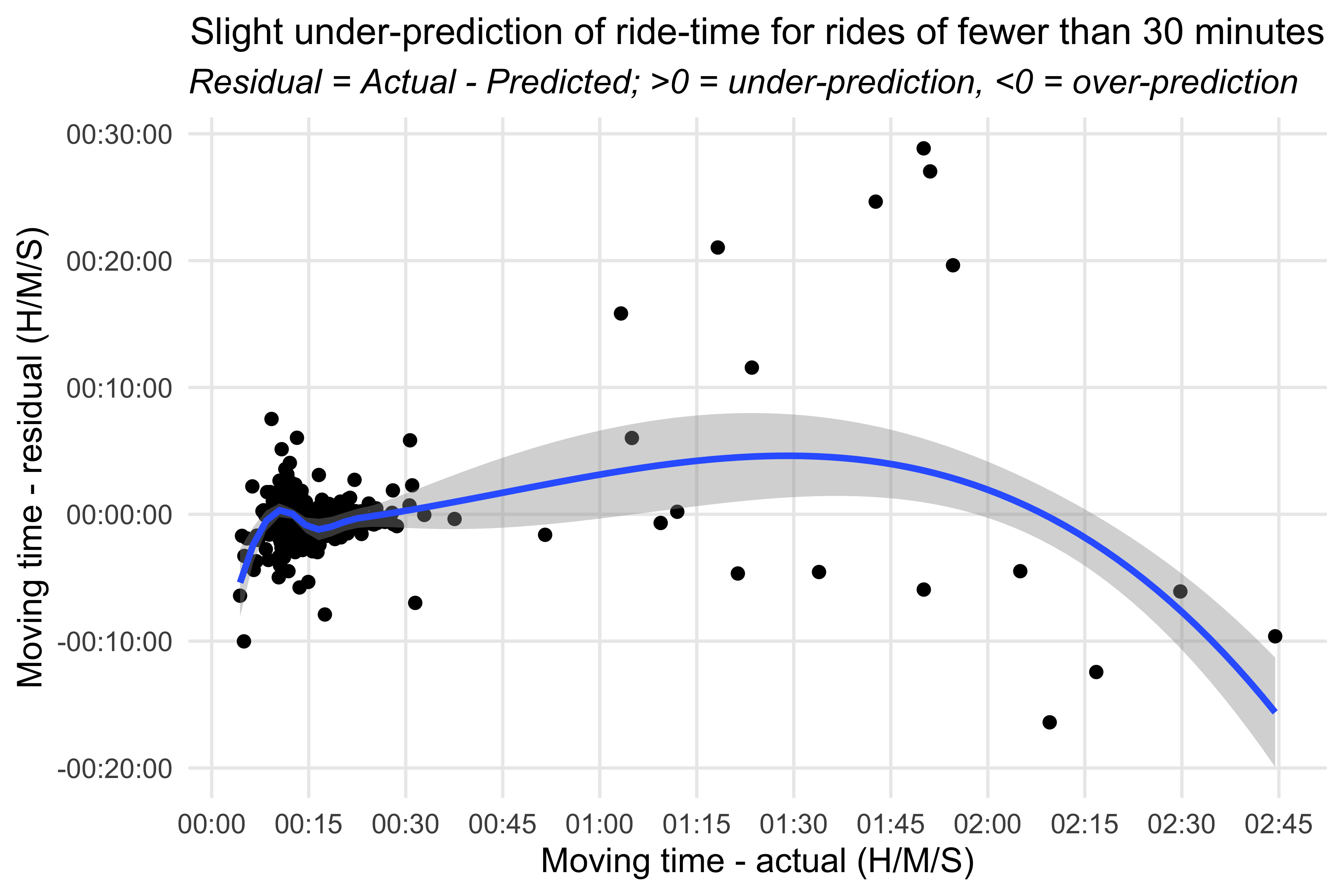
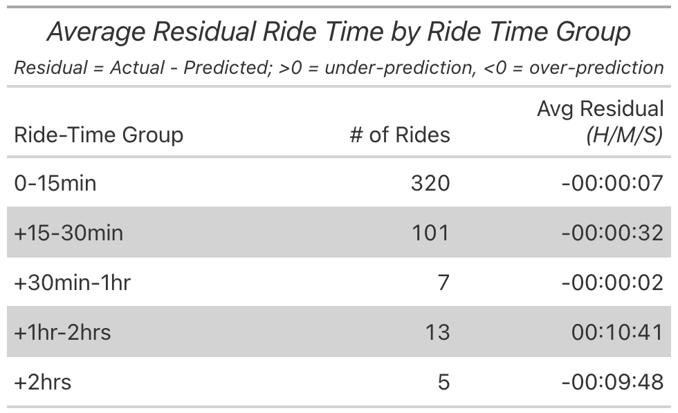
Plotting the residuals - Kilojoules model
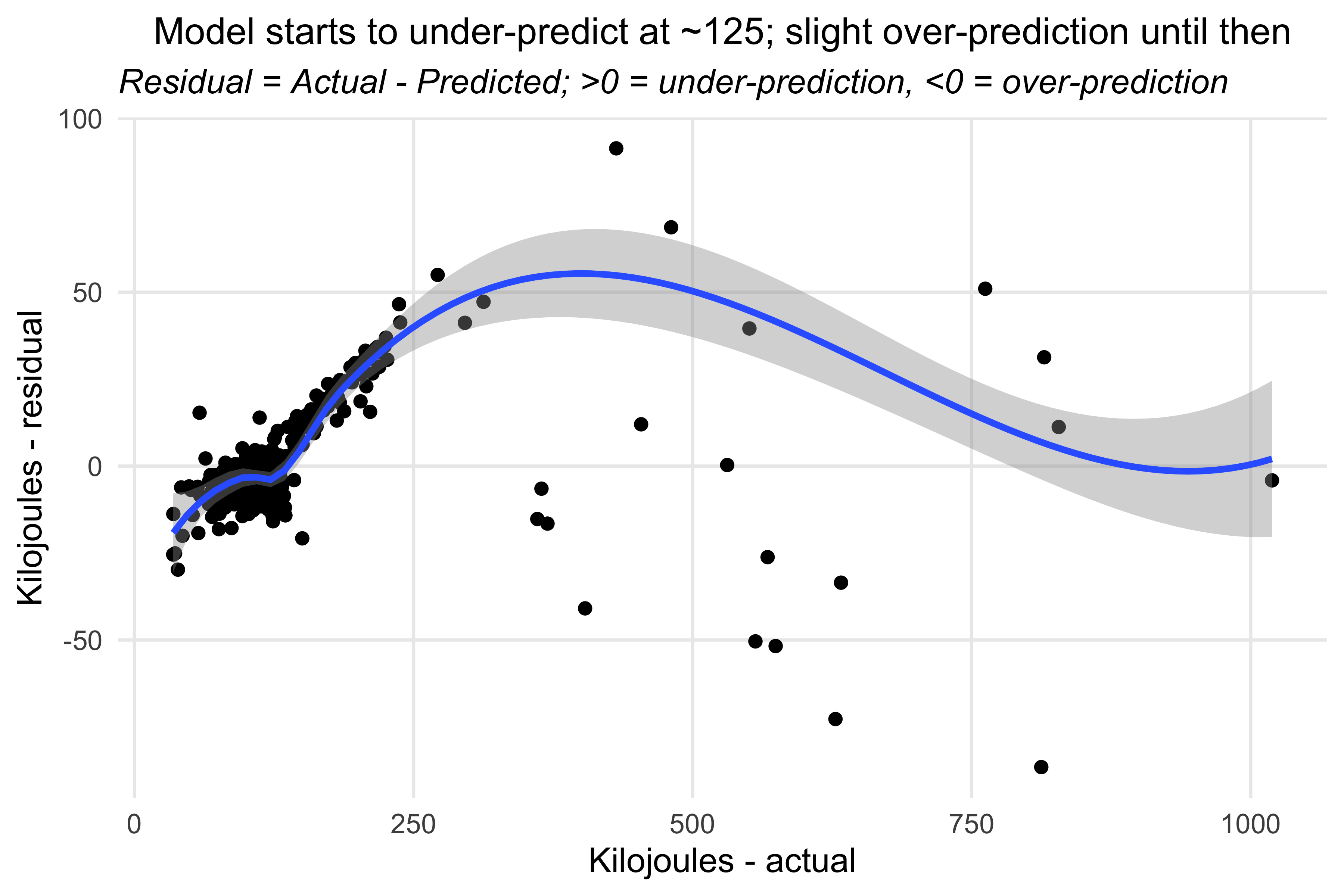
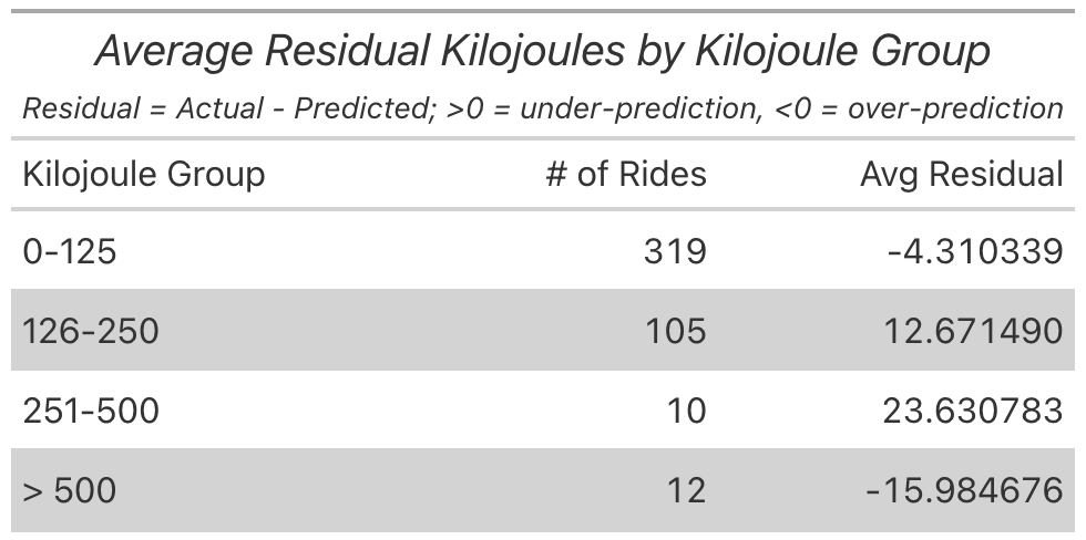
Plotting the residuals - Watts model
About that last ride…
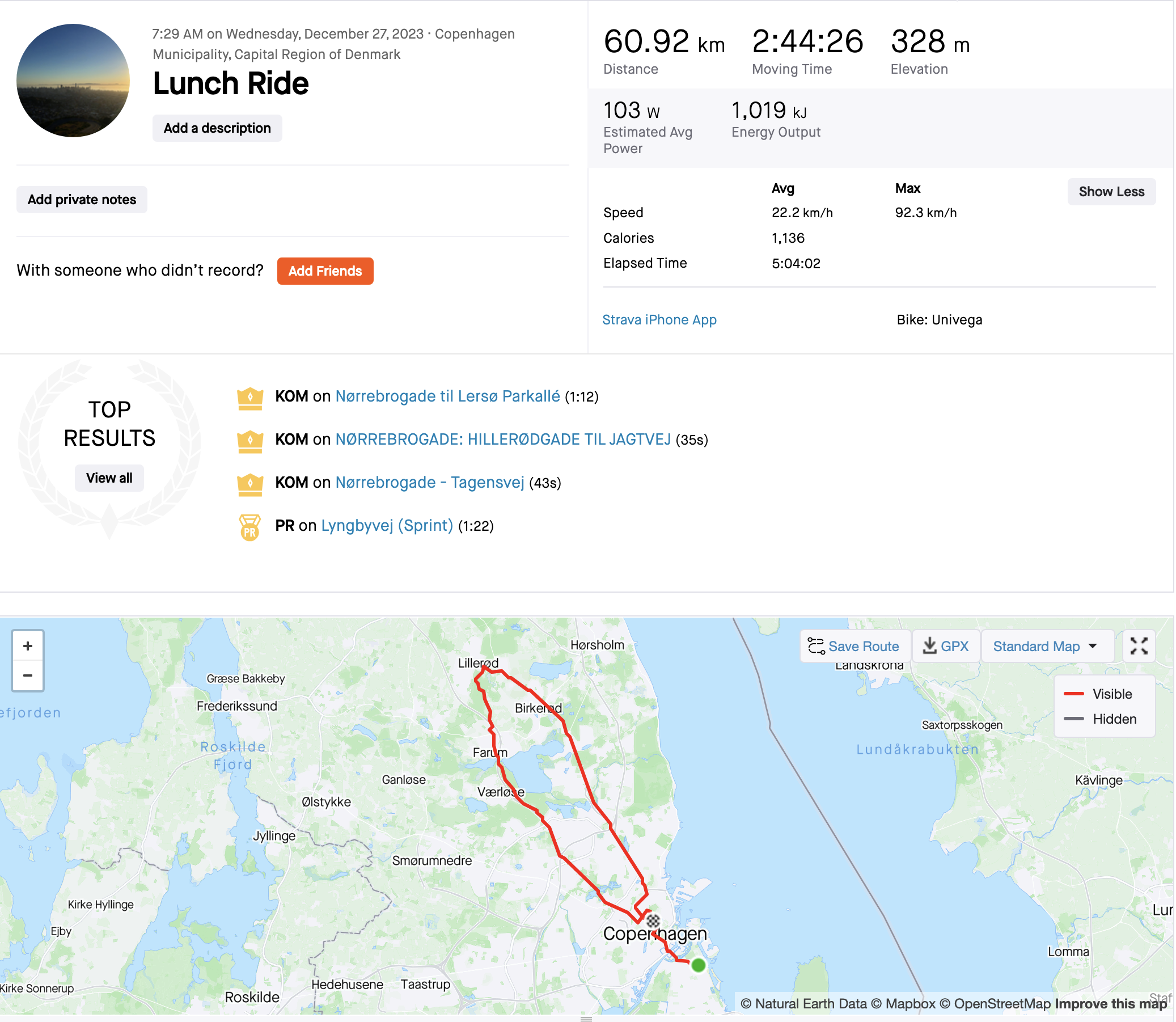
About that last ride…
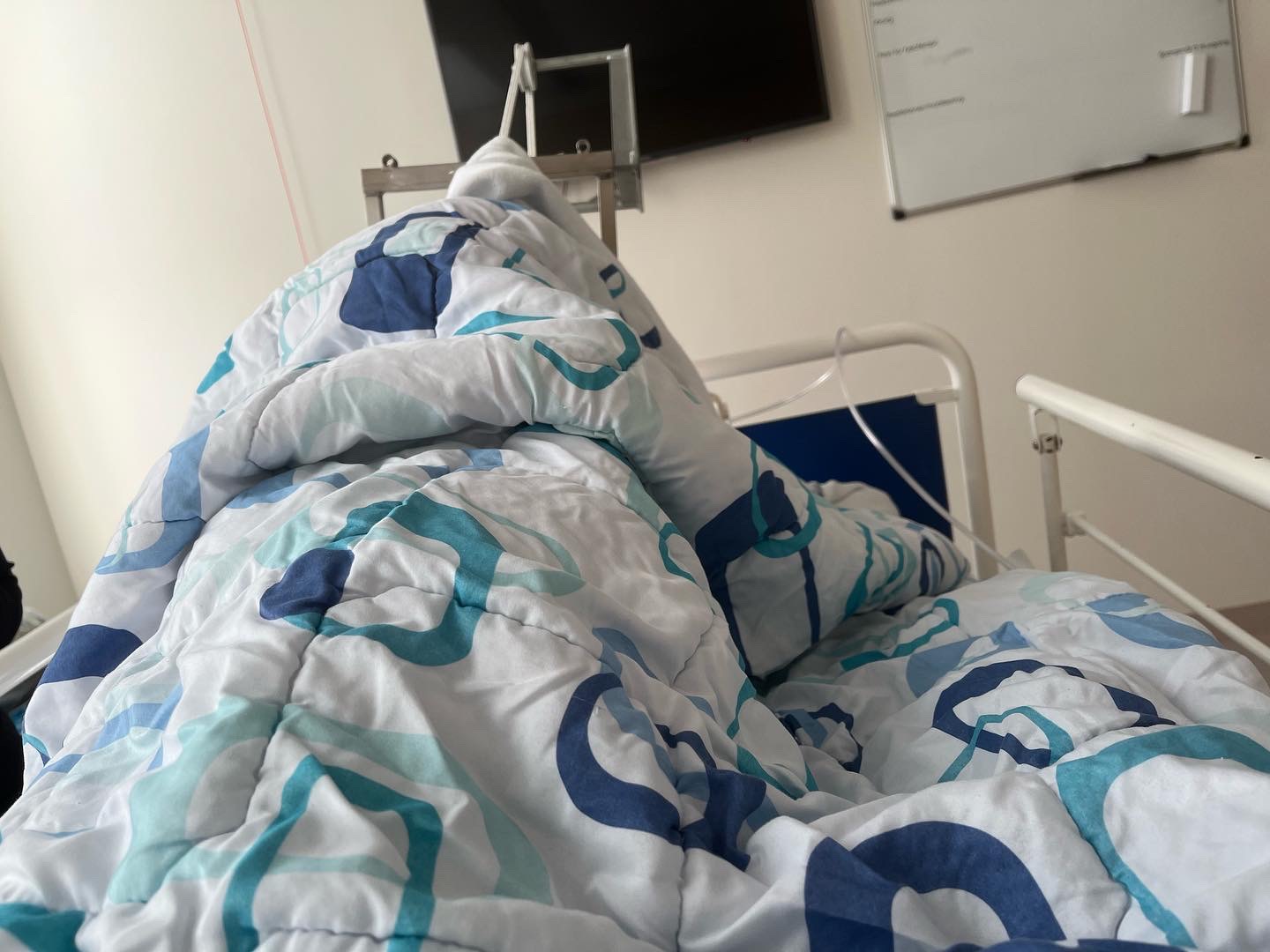
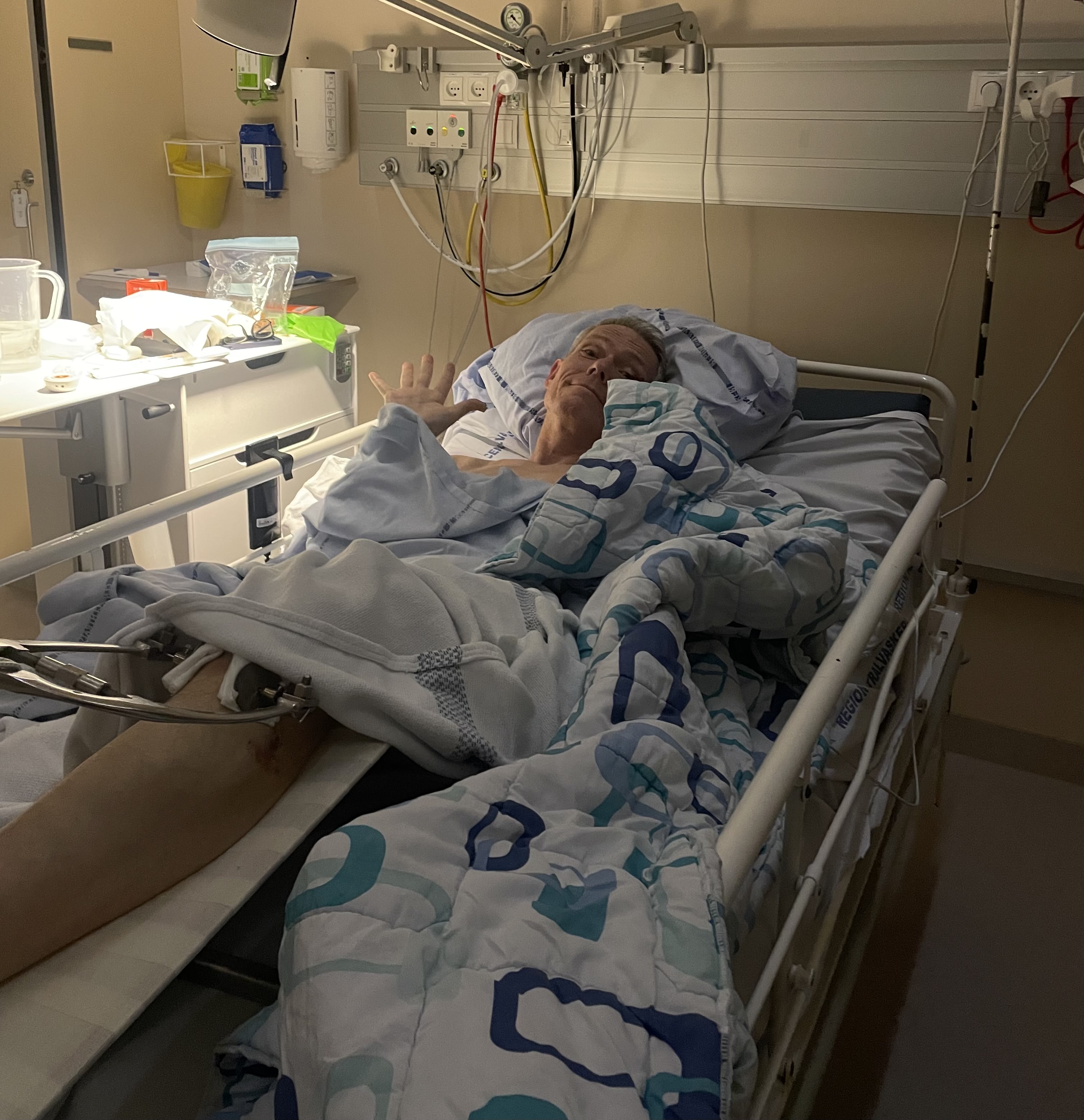
About that last ride…
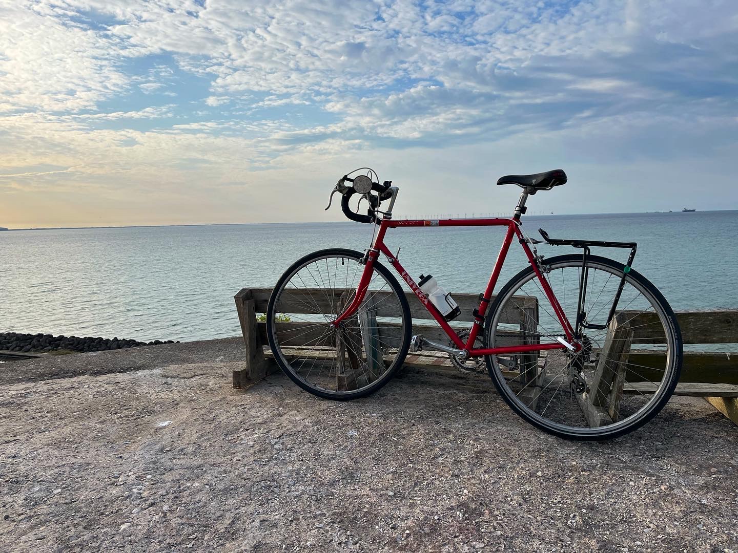
- Have you seen this bike?
- Vintage Univega, red…last seen in Nørrebro, near Nørrebro Station
What questions do you have?